 |
The dot on the '?' (question-mark) is diamond-shaped or triangular.
|
 |
The centre bar of the upper-case 'P' meets the vertical.
|
 |
The upper-case 'U' has a stem/serif.
|
 |
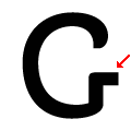
The upper-case 'G' has a spur/tail.
|
 |
The upper-case 'G' has double-sided bar.
|
 |
The top of the upper-case 'A' has a serif or cusp on the left.
|
 |
The upper-case 'E' is normal letter shape.
|
 |
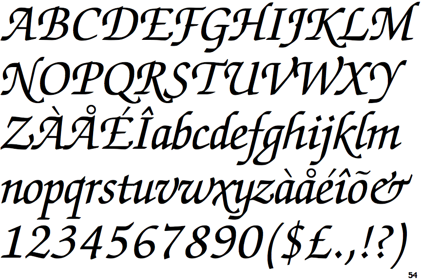
The strokes are sloped right (italic, oblique, or cursive).
|
 |
The dot on the lower-case 'i' or 'j' is diamond-shaped.
|
 |
The upper-case 'L' has no loops.
|
There are more than ten differences; only the first ten are shown.
Note that the fonts in the icons shown above represent general examples, not necessarily the two fonts chosen for comparison.
Show Examples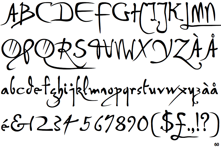
 |
The dot on the '?' (question-mark) is circular or oval.
|
 |
The centre bar of the upper-case 'P' crosses the vertical.
|
 |
The upper-case 'U' has no stem/serif.
|
 |
The upper-case 'G' has no spur/tail.
|
 |
The upper-case 'G' has a bar to the right.
|
 |
The top of the upper-case 'A' has no serifs or cusps.
|
 |
The upper-case 'E' is drawn as a 'C' with a bar.
|
 |
The strokes are upright.
|
 |
The dot on the lower-case 'i' or 'j' is circular or oval.
|
 |
The upper-case 'L' has one lower loop only.
|