Differences
ITC Willow
 |
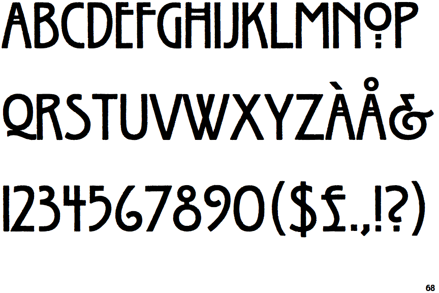
The upper-case 'Q' tail touches the circle.
|
 |
The '$' (dollar) has a single line crossing the 'S'.
|
 |
The '&' (ampersand) looks like 'Et' with a gap at the top.
|
 |
The '4' is open.
|
 |
The centre vertex of the upper-case 'M' is above the baseline.
|
 |
The top storey of the '3' is a smooth curve.
|
 |
The upper-case 'G' has no bar.
|
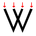 |
The top of the upper-case 'W' has four upper terminals.
|
 |
The hole (counter) in the upper-case 'P' or 'R' is approximately D-shaped.
|
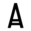 |
The bar of the upper-case 'A' is a double or triple line.
|
There are more than ten differences; only the first ten are shown.
Note that the fonts in the icons shown above represent general examples, not necessarily the two fonts chosen for comparison.
Show ExamplesP22 Arts and Crafts
 |
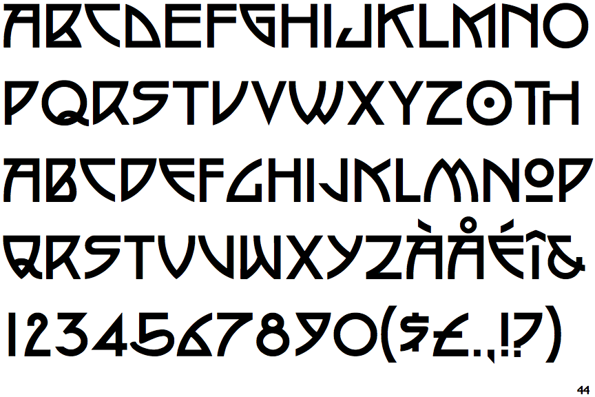
The upper-case 'Q' tail crosses the circle.
|
 |
The '$' (dollar) has a single line which does not cross the 'S'.
|
 |
The '&' (ampersand) is traditional style with a gap at the top.
|
 |
The '4' is closed.
|
 |
The centre vertex of the upper-case 'M' is on the baseline.
|
 |
The top storey of the '3' is a sharp angle.
|
 |
The upper-case 'G' has a bar to the left.
|
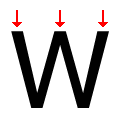 |
The top of the upper-case 'W' has three upper terminals.
|
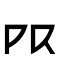 |
The hole (counter) in the upper-case 'P' or 'R' is triangular.
|
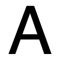 |
The bar of the upper-case 'A' is a single horizontal line.
|
