Identifont

Fonts by Appearance

Fonts by Name

Fonts by Similarity

Fonts by Picture

Fonts by Designer/Publisher

Differences

TweetTweet Differences

Compare: and  

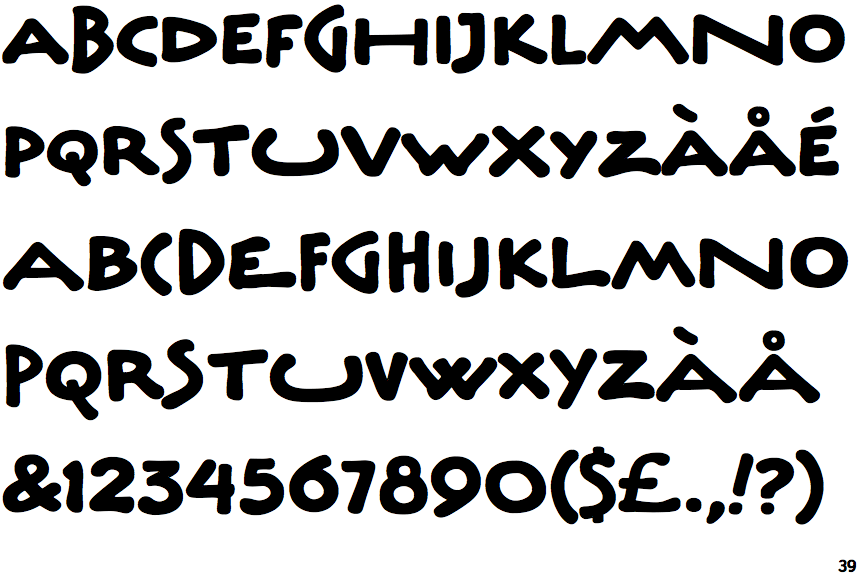
ITC Underscript

ITC Underscript

Open
The '4' is open.
Sloping
The verticals of the upper-case 'M' are sloping.
Angled
The top storey of the '3' is a sharp angle.
No bar
The upper-case 'G' has no bar.
Two
The upper-case 'Y' right-hand arm forms a continuous stroke with the tail.
Flat
The right side of the upper-case 'G' has a flat section.

Note that the fonts in the icons shown above represent general examples, not necessarily the two fonts chosen for comparison.

Show Examples
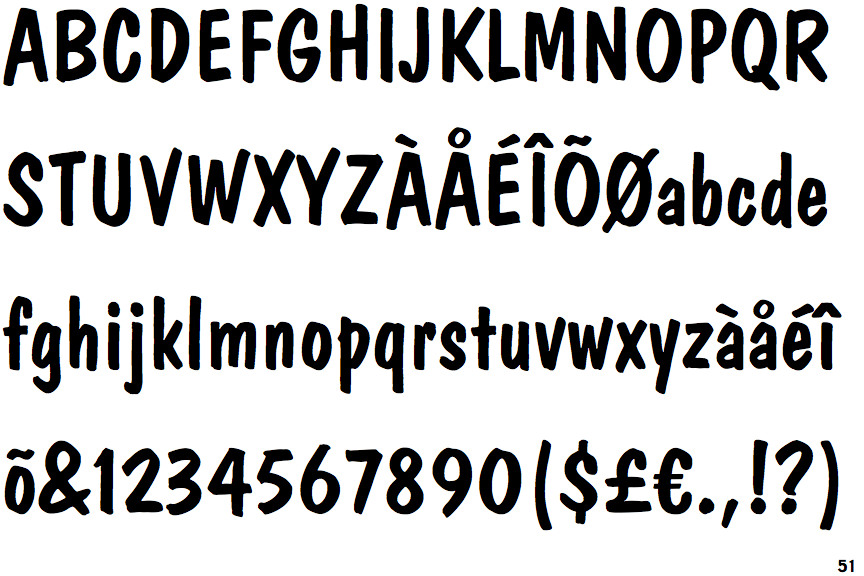
Dom Casual (BT)

Dom Casual (BT)

Closed
The '4' is closed.
Parallel
The verticals of the upper-case 'M' are parallel.
Round
The top storey of the '3' is a smooth curve.
Left
The upper-case 'G' has a bar to the left.
Three
The upper-case 'Y' arms and tail are separate strokes.
Curved
The right side of the upper-case 'G' is curved.