 |
The upper-case 'J' sits on the baseline.
|
 |
The '4' is open.
|
 |
The top storey of the '3' is a smooth curve.
|
 |
The lower-case 'g' is double-storey (with or without gap).
|
 |
The upper-case 'U' has no stem/serif.
|
 |
The top stroke of the upper-case 'C' has a vertical or angled upward-pointing serif.
|
 |
The upper-case 'G' foot has a downward pointing spur.
|
 |
The centre vertex of the upper-case 'W' has two separate serifs.
|
 |
The upper-case 'J' has no spur.
|
 |
The foot of the '£' (pound) has a loop.
|
Note that the fonts in the icons shown above represent general examples, not necessarily the two fonts chosen for comparison.
Show Examples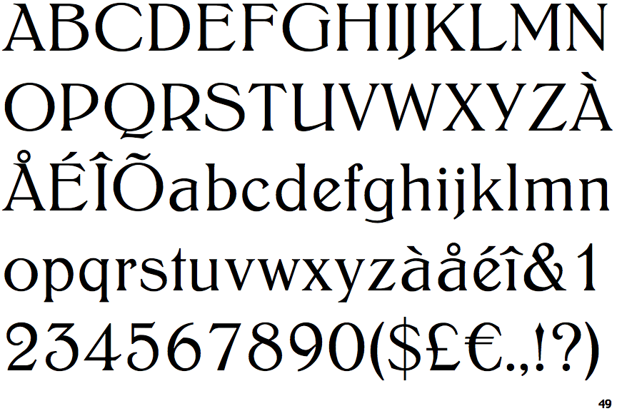
 |
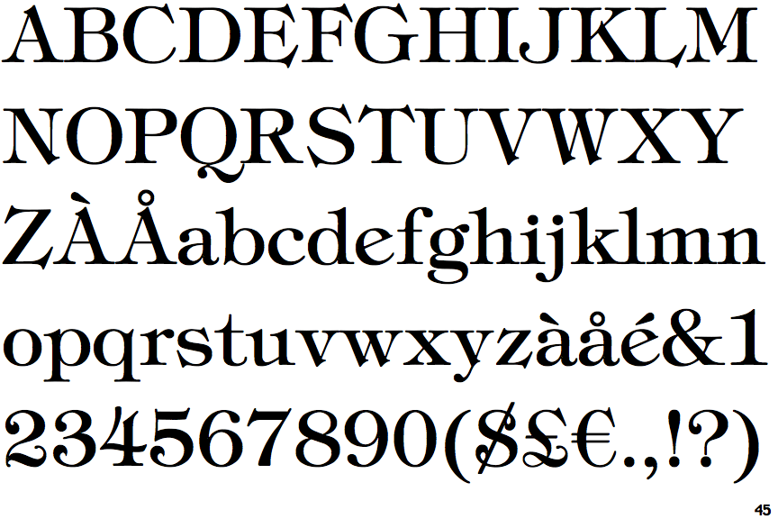
The upper-case 'J' descends below the baseline.
|
 |
The '4' is closed.
|
 |
The top storey of the '3' is a sharp angle.
|
 |
The lower-case 'g' is single-storey (with or without loop).
|
 |
The upper-case 'U' has a stem/serif.
|
 |
The top stroke of the upper-case 'C' has no upward-pointing serif.
|
 |
The upper-case 'G' foot has no spur or serif.
|
 |
The centre vertex of the upper-case 'W' has no serifs.
|
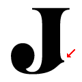 |
The upper-case 'J' has a spur.
|
 |
The foot of the '£' (pound) has no loop.
|