 |
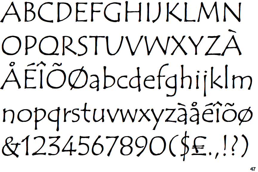
The '4' is open.
|
 |
The verticals of the upper-case 'M' are sloping.
|
 |
The top storey of the '3' is a sharp angle.
|
 |
The centre bar of the upper-case 'P' crosses the vertical.
|
 |
The upper-case 'U' has no stem/serif.
|
 |
The upper-case 'G' has no bar.
|
 |
The right side of the upper-case 'G' has a flat section.
|
 |
The upper-case letter 'I' is plain.
|
 |
The upper-case 'I' is a single stroke with no serifs.
|
Note that the fonts in the icons shown above represent general examples, not necessarily the two fonts chosen for comparison.
Show Examples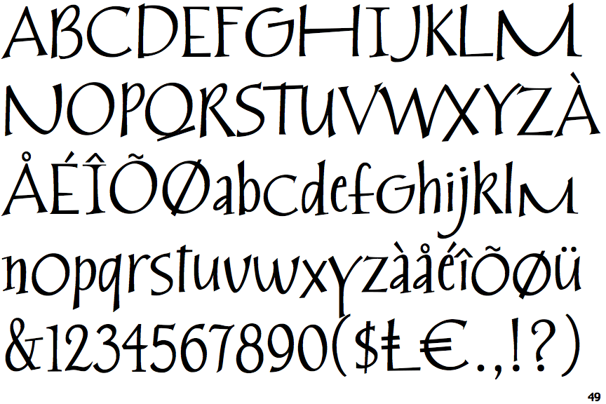
 |
The '4' is closed.
|
 |
The verticals of the upper-case 'M' are parallel.
|
 |
The top storey of the '3' is a smooth curve.
|
 |
The centre bar of the upper-case 'P' meets the vertical.
|
 |
The upper-case 'U' has a stem/serif.
|
 |
The upper-case 'G' has a bar to the left.
|
 |
The right side of the upper-case 'G' is curved.
|
 |
The upper-case letter 'I' has serifs/bars.
|
 |
The upper-case 'I' is a single stroke with serifs.
|