 |
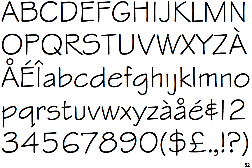
The '&' (ampersand) looks like an 'E' with a solid or broken line.
|
 |
The centre vertex of the upper-case 'M' is on the baseline.
|
 |
The upper-case 'G' has no spur/tail.
|
 |
The lower-case 'u' has no stem/serif.
|
 |
The top of the upper-case 'W' has three upper terminals.
|
Note that the fonts in the icons shown above represent general examples, not necessarily the two fonts chosen for comparison.
Show Examples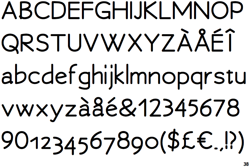
 |
The '&' (ampersand) is traditional style with two enclosed loops.
|
 |
The centre vertex of the upper-case 'M' is above the baseline.
|
 |
The upper-case 'G' has a spur/tail.
|
 |
The lower-case 'u' has a stem/serif.
|
 |
The top of the upper-case 'W' has four upper terminals.
|