Differences
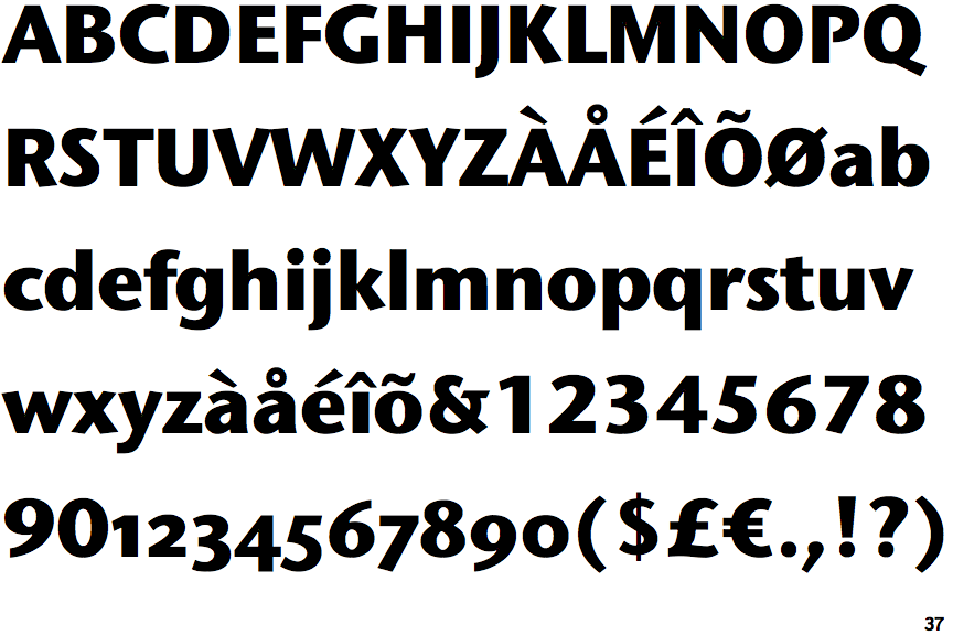
ITC Stone Sans II Extra Bold
 |
The '&' (ampersand) is traditional style with a gap at the top.
|
 |
The upper-case 'J' descends below the baseline.
|
 |
The centre vertex of the upper-case 'M' is on the baseline.
|
 |
The dot on the '?' (question-mark) is circular or oval.
|
 |
The centre bar of the upper-case 'P' leaves a gap with the vertical.
|
 |
The upper-case 'G' has no bar.
|
 |
The upper-case 'J' has no bar.
|
 |
The dot on the lower-case 'i' or 'j' is circular or oval.
|
 |
The tail of the lower-case 'y' is curved or U-shaped to the left.
|
 |
The upper-case letter 'I' is plain.
|
There are more than ten differences; only the first ten are shown.
Note that the fonts in the icons shown above represent general examples, not necessarily the two fonts chosen for comparison.
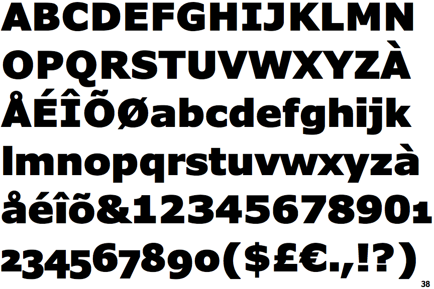
Show ExamplesVerdana Pro Black
 |
The '&' (ampersand) is traditional style with two enclosed loops.
|
 |
The upper-case 'J' sits on the baseline.
|
 |
The centre vertex of the upper-case 'M' is above the baseline.
|
 |
The dot on the '?' (question-mark) is square or rectangular.
|
 |
The centre bar of the upper-case 'P' meets the vertical.
|
 |
The upper-case 'G' has a bar to the left.
|
 |
The upper-case 'J' has a bar to the left.
|
 |
The dot on the lower-case 'i' or 'j' is square or rectangular.
|
 |
The tail of the lower-case 'y' is substantially straight.
|
 |
The upper-case letter 'I' has serifs/bars.
|

