 |
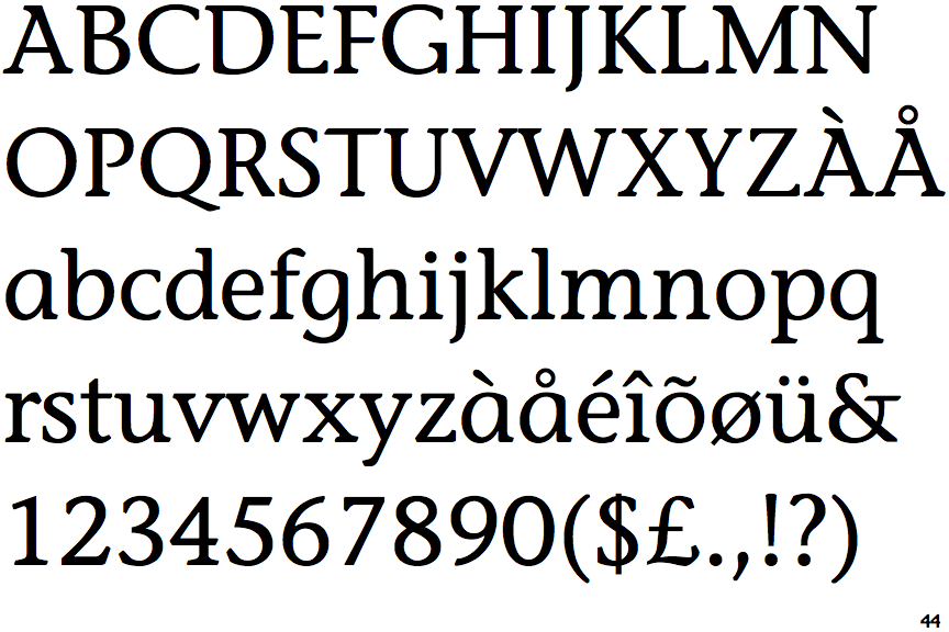
The '&' (ampersand) is traditional style with a gap at the top.
|
 |
The '4' is closed.
|
 |
The centre vertex of the upper-case 'M' is on the baseline.
|
 |
The top storey of the '3' is a smooth curve.
|
 |
The lower-case 'a' stem stops at the top of the bowl (single storey).
|
 |
The top of the upper-case 'A' has a serif or cusp on the left.
|
 |
The upper-case 'G' foot has a downward pointing spur.
|
 |
The centre bar of the upper-case 'R' meets the vertical.
|
 |
The bar of the upper-case 'G' is single-sided, left-facing.
|
 |
The lower-case 'e' has a straight horizontal bar.
|
Note that the fonts in the icons shown above represent general examples, not necessarily the two fonts chosen for comparison.
Show Examples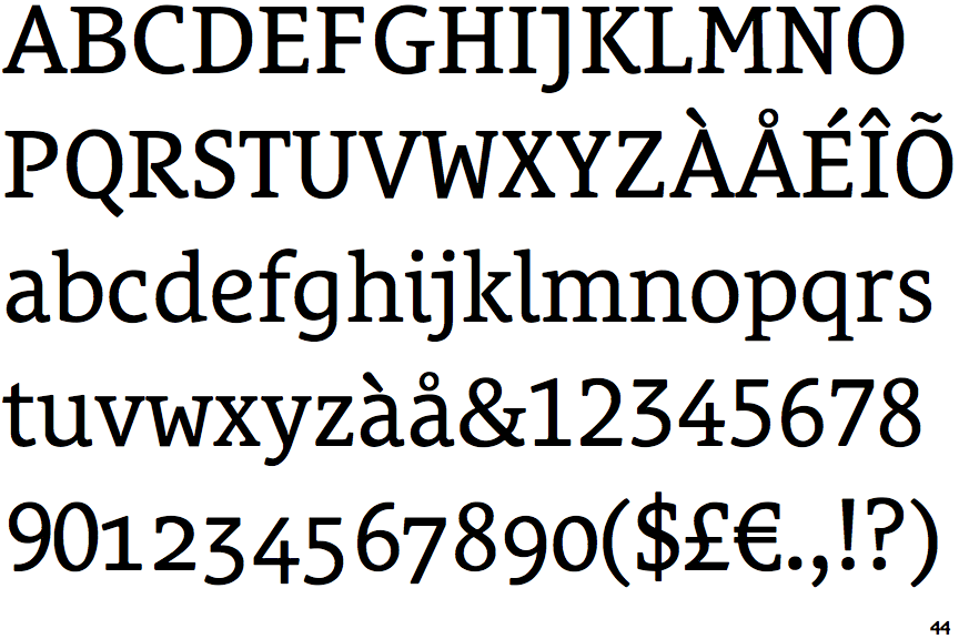
 |
The '&' (ampersand) is traditional style with two enclosed loops.
|
 |
The '4' is open.
|
 |
The centre vertex of the upper-case 'M' is above the baseline.
|
 |
The top storey of the '3' is a sharp angle.
|
 |
The lower-case 'a' stem curves over the top of the bowl (double storey).
|
 |
The top of the upper-case 'A' has no serifs or cusps.
|
 |
The upper-case 'G' foot has no spur or serif.
|
 |
The centre bar of the upper-case 'R' leaves a gap with the vertical.
|
 |
The bar of the upper-case 'G' is double-sided.
|
 |
The lower-case 'e' has a curved bar with no straight segment.
|