Identifont

Fonts by Appearance

Fonts by Name

Fonts by Similarity

Fonts by Picture

Fonts by Designer/Publisher

Differences

TweetTweet Differences

Compare: and  

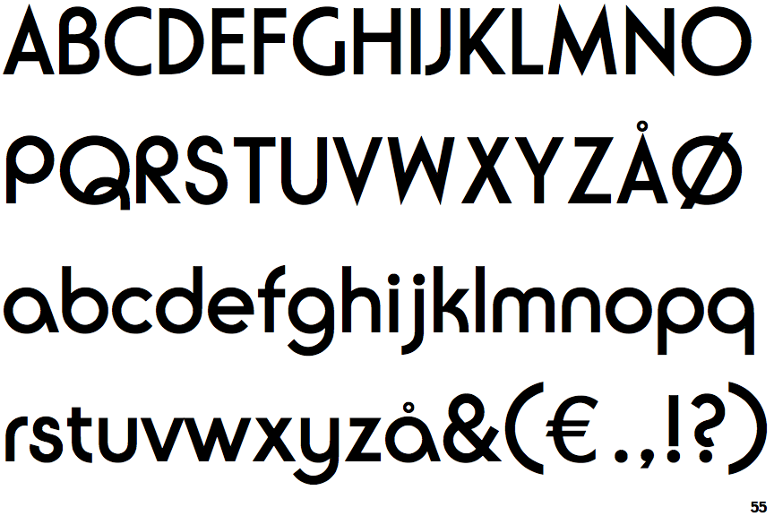
ITC Ronda (Linotype)

ITC Ronda (Linotype)

Double
The diagonal strokes of the upper-case 'K' meet in a 'T'.
Sloping
The verticals of the upper-case 'M' are sloping.
No bar
The upper-case 'G' has no bar.
Flat
The right side of the upper-case 'G' has a flat section.
Curved
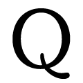
The tail of the upper-case 'Q' is curved or S-shaped.

Note that the fonts in the icons shown above represent general examples, not necessarily the two fonts chosen for comparison.

Show Examples
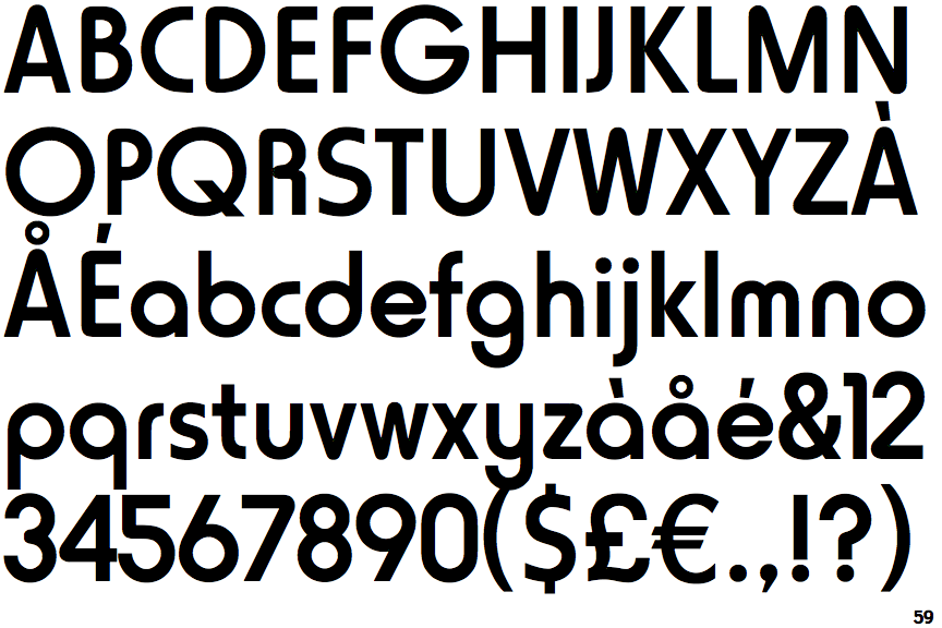
Linotype Horatio

Linotype Horatio

Single
The diagonal strokes of the upper-case 'K' meet at the vertical (with or without a gap).
Parallel
The verticals of the upper-case 'M' are parallel.
Left
The upper-case 'G' has a bar to the left.
Curved
The right side of the upper-case 'G' is curved.
Straight
The tail of the upper-case 'Q' is straight.