 |
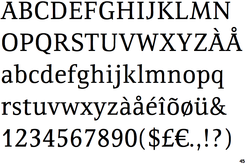
The upper-case 'J' sits on the baseline.
|
 |
The dot on the '?' (question-mark) is circular or oval.
|
 |
The verticals of the upper-case 'M' are sloping.
|
 |
The top of the upper-case 'A' has serifs both sides, or a top bar.
|
 |
The centre bar of the upper-case 'E' has serifs.
|
 |
The upper-case 'G' foot has a downward pointing spur.
|
 |
The dot on the lower-case 'i' or 'j' is circular or oval.
|
 |
The lower storey of the lower-case 'g' has a gap.
|
 |
The centre bar of the upper-case 'F' has serifs.
|
 |
The junction of the upper-case 'K' leaves a visible gap with the vertical.
|
Note that the fonts in the icons shown above represent general examples, not necessarily the two fonts chosen for comparison.
Show Examples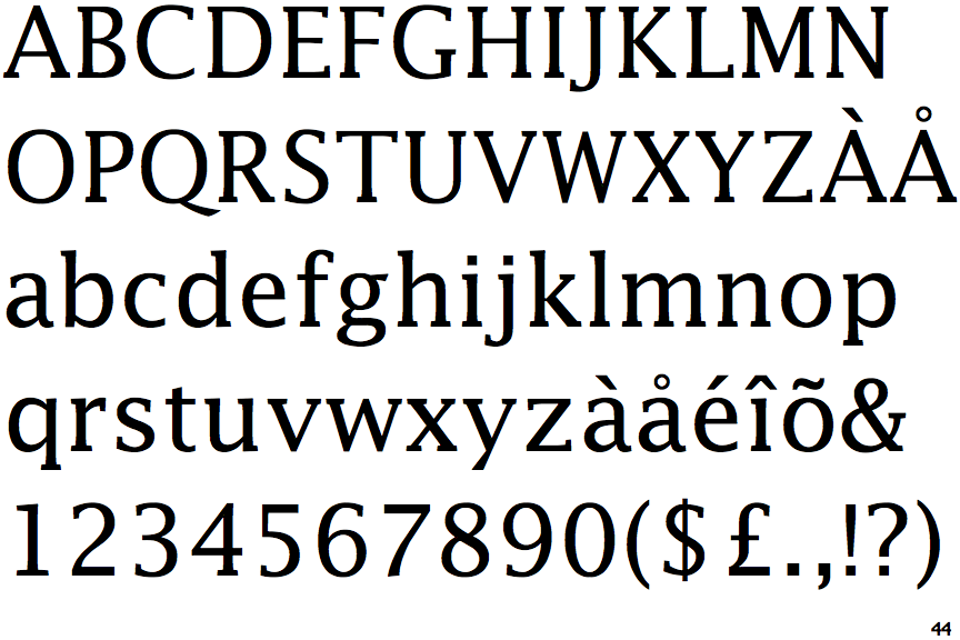
 |
The upper-case 'J' descends below the baseline.
|
 |
The dot on the '?' (question-mark) is square or rectangular.
|
 |
The verticals of the upper-case 'M' are parallel.
|
 |
The top of the upper-case 'A' has no serifs or cusps.
|
 |
The centre bar of the upper-case 'E' has no serifs.
|
 |
The upper-case 'G' foot has no spur or serif.
|
 |
The dot on the lower-case 'i' or 'j' is square or rectangular.
|
 |
The lower storey of the lower-case 'g' has no gap.
|
 |
The centre bar of the upper-case 'F' has no serifs.
|
 |
The junction of the upper-case 'K' touches the vertical.
|