Identifont

Fonts by Appearance

Fonts by Name

Fonts by Similarity

Fonts by Picture

Fonts by Designer/Publisher

Differences

TweetTweet Differences

Compare: and  

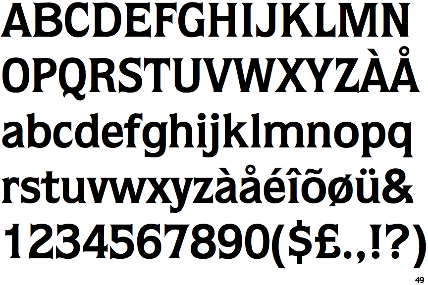
ITC Quorum Bold

ITC Quorum Bold

Double
The diagonal strokes of the upper-case 'K' meet in a 'T'.
Parallel
The verticals of the upper-case 'M' are parallel.
Top serif
The top stroke of the upper-case 'C' has a vertical or angled upward-pointing serif.
Double
The bar of the upper-case 'G' is double-sided.

Note that the fonts in the icons shown above represent general examples, not necessarily the two fonts chosen for comparison.

Show Examples
Agora Bold

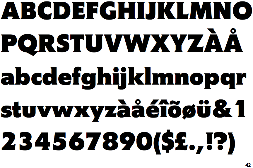
Agora Bold

Single
The diagonal strokes of the upper-case 'K' meet at the vertical (with or without a gap).
Sloping
The verticals of the upper-case 'M' are sloping.
No top serif
The top stroke of the upper-case 'C' has no upward-pointing serif.
Left
The bar of the upper-case 'G' is single-sided, left-facing.