Identifont

Fonts by Appearance

Fonts by Name

Fonts by Similarity

Fonts by Picture

Fonts by Designer/Publisher

Differences

TweetTweet Differences

Compare: and  

ITC Pioneer No. 2 (EF)

ITC Pioneer No. 2 (EF)

Above
The centre vertex of the upper-case 'M' is above the baseline.
Parallel
The verticals of the upper-case 'M' are parallel.
Left
The upper-case 'G' has a bar to the left.
Parallel
The upper-case 'A' has parallel verticals.

Note that the fonts in the icons shown above represent general examples, not necessarily the two fonts chosen for comparison.

Show Examples
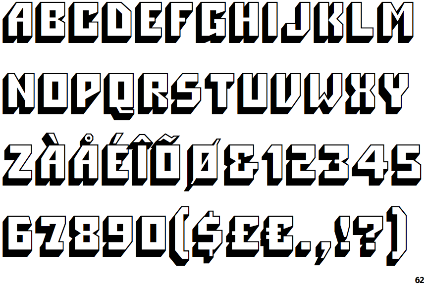
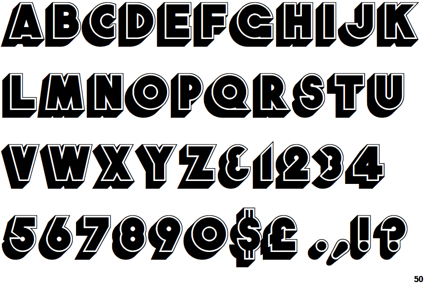
Font Solid

Font Solid

Baseline
The centre vertex of the upper-case 'M' is on the baseline.
Sloping
The verticals of the upper-case 'M' are sloping.
No bar
The upper-case 'G' has no bar.
Tapered
The upper-case 'A' has tapered verticals.