 |
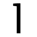
The '4' is open.
|
 |
The verticals of the upper-case 'M' are sloping.
|
 |
The upper-case 'G' has no spur/tail.
|
 |
The 'l' (lower-case 'L') has a right-facing lower serif or tail.
|
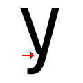 |
There is a break at the junction of the lower-case 'y'.
|
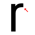 |
The arm of the lower-case 'r' points upwards or slightly downwards.
|
 |
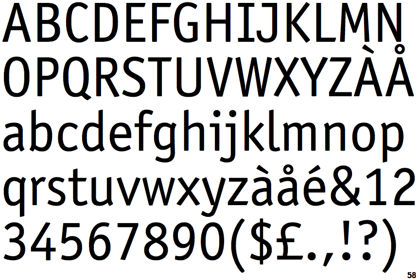
The character widths are variable (proportional).
|
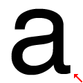 |
The stem of the lower-case 'a' is curved.
|
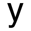 |
The tail of the lower-case 'y' is curved to the left or slightly upwards.
|
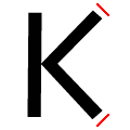 |
The ends of the upper-case 'K' strokes are both angled.
|
There are more than ten differences; only the first ten are shown.
Note that the fonts in the icons shown above represent general examples, not necessarily the two fonts chosen for comparison.
Show Examples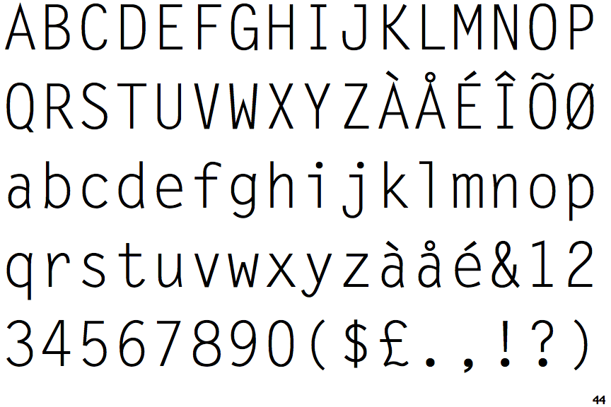
 |
The '4' is closed.
|
 |
The verticals of the upper-case 'M' are parallel.
|
 |
The upper-case 'G' has a spur/tail.
|
 |
The 'l' (lower-case 'L') has a left-facing upper serif.
|
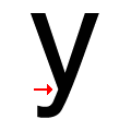 |
There is a smooth join at the junction of the lower-case 'y'.
|
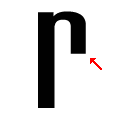 |
The arm of the lower-case 'r' points downwards.
|
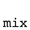 |
The character widths are fixed (monospaced).
|
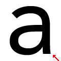 |
The stem of the lower-case 'a' is straight.
|
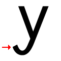 |
The tail of the lower-case 'y' is U-shaped.
|
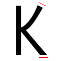 |
The ends of the upper-case 'K' strokes are angled or vertical at the top, horizontal at the bottom.
|