 |
The centre vertex of the upper-case 'M' is above the baseline.
|
 |
The top storey of the '3' is a smooth curve.
|
 |
The centre bar of the upper-case 'R' leaves a gap with the vertical.
|
 |
The bar of the upper-case 'G' is single-sided, left-facing.
|
 |
The feet of the lower-case 'h' have two serifs on the left and one on the right.
|
 |
The lower storey of the lower-case 'g' has no gap.
|
 |
The top vertices of the upper-case 'M' have symmetrical single-sided serifs.
|
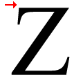 |
The top stroke of the upper-case 'Z' has no upward-pointing serif.
|
 |
The junction of the upper-case 'K' leaves a visible gap with the vertical.
|
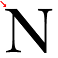 |
The top-left vertex of the upper-case 'N' has one serif.
|
Note that the fonts in the icons shown above represent general examples, not necessarily the two fonts chosen for comparison.
Show Examples
 |
The centre vertex of the upper-case 'M' is on the baseline.
|
 |
The top storey of the '3' is a sharp angle.
|
 |
The centre bar of the upper-case 'R' meets the vertical.
|
 |
The bar of the upper-case 'G' is double-sided.
|
 |
The feet of the lower-case 'h' have two serifs on each foot.
|
 |
The lower storey of the lower-case 'g' has a gap.
|
 |
The top vertices of the upper-case 'M' have no top serifs.
|
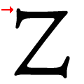 |
The top stroke of the upper-case 'Z' has a vertical or angled upward-pointing serif.
|
 |
The junction of the upper-case 'K' touches the vertical.
|
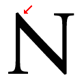 |
The top-left vertex of the upper-case 'N' has no serifs.
|