Differences
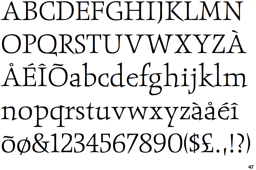
ITC Obelisk Light
 |
The diagonal strokes of the upper-case 'K' meet at the vertical (with or without a gap).
|
 |
The centre vertex of the upper-case 'M' is above the baseline.
|
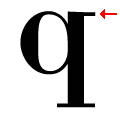 |
The top of the lower-case 'q' has a right-facing serif.
|
 |
The centre bar of the upper-case 'R' leaves a gap with the vertical.
|
 |
The foot of the '4' has double-sided serifs.
|
 |
The bar of the upper-case 'G' is single-sided, left-facing.
|
 |
The dot on the lower-case 'i' or 'j' is circular or oval.
|
 |
The feet of the lower-case 'h' have two serifs on the left and one on the right.
|
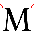 |
The top vertices of the upper-case 'M' have symmetrical single-sided serifs.
|
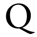 |
The tail of the upper-case 'Q' is single-sided.
|
There are more than ten differences; only the first ten are shown.
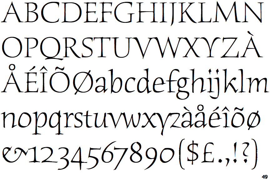
Note that the fonts in the icons shown above represent general examples, not necessarily the two fonts chosen for comparison.
Show ExamplesITC Humana Serif Light
 |
The diagonal strokes of the upper-case 'K' meet in a 'T'.
|
 |
The centre vertex of the upper-case 'M' is on the baseline.
|
 |
The top of the lower-case 'q' has a vertical or slightly angled spur (pointed or flat).
|
 |
The centre bar of the upper-case 'R' meets the vertical.
|
 |
The foot of the '4' has no serifs.
|
 |
The bar of the upper-case 'G' is double-sided.
|
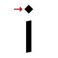 |
The dot on the lower-case 'i' or 'j' is diamond-shaped.
|
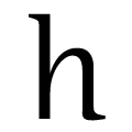 |
The feet of the lower-case 'h' have no serifs on the left and one on the right.
|
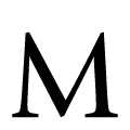 |
The top vertices of the upper-case 'M' have no top serifs.
|
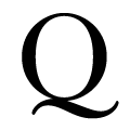 |
The tail of the upper-case 'Q' is double-sided.
|
