 |
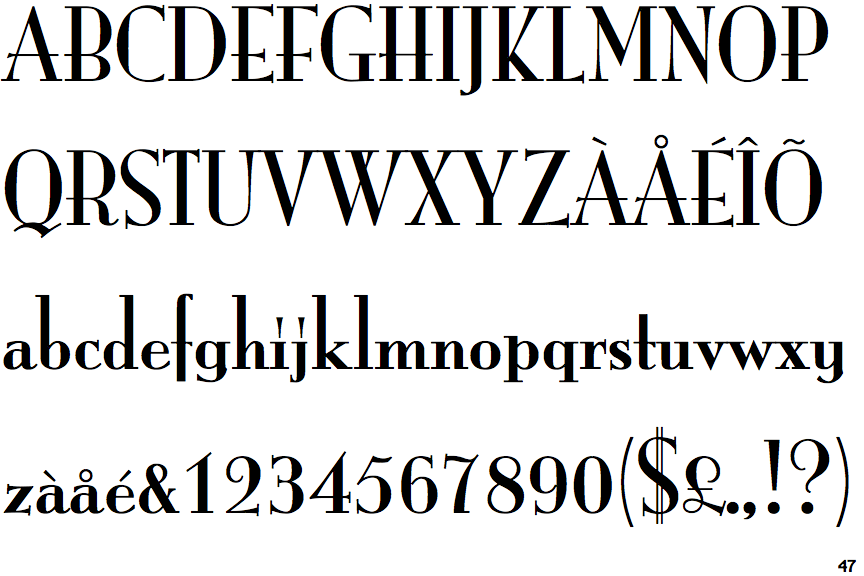
The centre vertex of the upper-case 'M' is above the baseline.
|
 |
The centre bar of the upper-case 'P' crosses the vertical.
|
 |
The top of the upper-case 'A' has no serifs or cusps.
|
 |
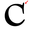
The top stroke of the upper-case 'C' has a vertical or angled upward-pointing serif.
|
 |
The upper-case 'G' foot has a forward pointing spur or serif.
|
 |
The top of the upper-case 'W' has four upper terminals.
|
 |
The sides of the lower-case 'y' are parallel (U-shaped).
|
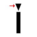 |
The dot on the lower-case 'i' or 'j' is triangular.
|
 |
The feet of the lower-case 'h' have two serifs on the left and one on the right.
|
 |
The stroke of the lower-case 'c' has an upward-pointing serif.
|
There are more than ten differences; only the first ten are shown.
Note that the fonts in the icons shown above represent general examples, not necessarily the two fonts chosen for comparison.
Show Examples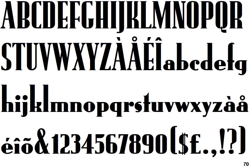
 |
The centre vertex of the upper-case 'M' is on the baseline.
|
 |
The centre bar of the upper-case 'P' meets the vertical.
|
 |
The top of the upper-case 'A' has a serif or cusp on the left.
|
 |
The top stroke of the upper-case 'C' has no upward-pointing serif.
|
 |
The upper-case 'G' foot has no spur or serif.
|
 |
The top of the upper-case 'W' has three upper terminals.
|
 |
The sides of the lower-case 'y' are angled (V-shaped).
|
 |
The dot on the lower-case 'i' or 'j' is circular or oval.
|
 |
The feet of the lower-case 'h' have two serifs on each foot.
|
 |
The stroke of the lower-case 'c' has a rounded end or ball.
|