 |
The upper-case 'Q' tail crosses the circle.
|
 |
The '&' (ampersand) looks like an 'E' with a solid or broken line.
|
 |
The upper-case 'J' sits on the baseline.
|
 |
The '4' is closed.
|
 |
The centre vertex of the upper-case 'M' is above the baseline.
|
 |
The verticals of the upper-case 'M' are sloping.
|
 |
The strokes are upright.
|
 |
The bar of the '4' does not cross the vertical.
|
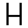 |
The bar of the upper-case 'H' is below centre.
|
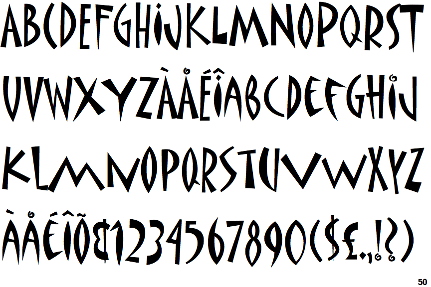
Note that the fonts in the icons shown above represent general examples, not necessarily the two fonts chosen for comparison.
Show Examples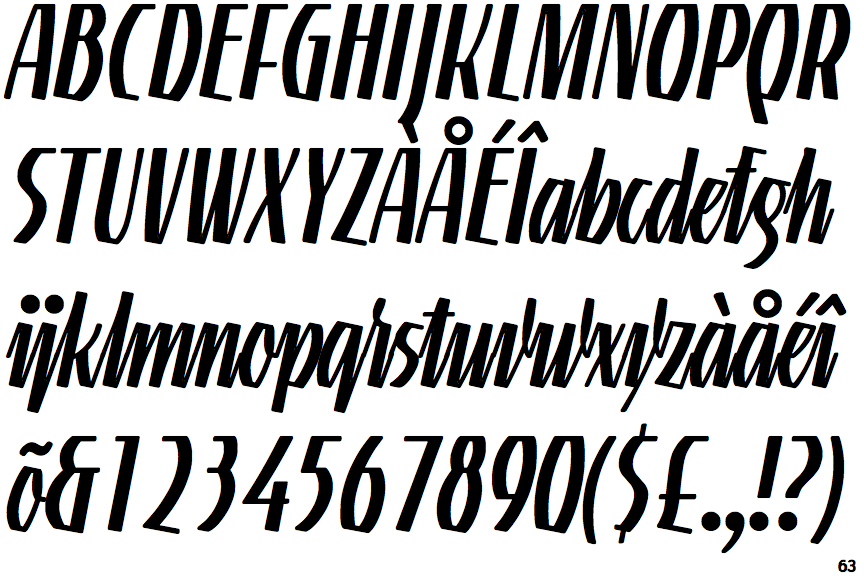
 |
The upper-case 'Q' tail touches the circle.
|
 |
The '&' (ampersand) looks like 'Et' with one enclosed loop (with or without exit stroke).
|
 |
The upper-case 'J' descends below the baseline.
|
 |
The '4' is open.
|
 |
The centre vertex of the upper-case 'M' is on the baseline.
|
|
The verticals of the upper-case 'M' are parallel.
|
 |
The strokes are sloped right (italic, oblique, or cursive).
|
 |
The bar of the '4' crosses the vertical.
|
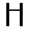 |
The bar of the upper-case 'H' is above centre.
|