 |
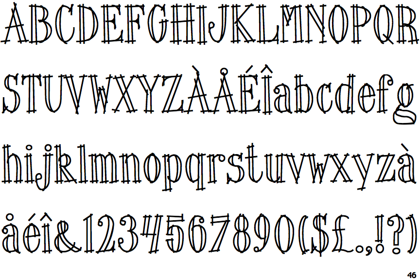
The upper-case 'J' sits on the baseline.
|
 |
The characters have serifs.
|
 |
The '4' is open.
|
 |
The centre vertex of the upper-case 'M' is above the baseline.
|
 |
The top storey of the '3' is a smooth curve.
|
 |
The upper-case 'U' has no stem/serif.
|
 |
The characters are outlined, shaded, or filled with a pattern.
|
 |
The upper-case 'Y' arms and tail are separate strokes.
|
 |
The lower storey of the lower-case 'g' has no gap.
|
Note that the fonts in the icons shown above represent general examples, not necessarily the two fonts chosen for comparison.
Show Examples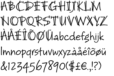
 |
The upper-case 'J' descends below the baseline.
|
 |
The characters do not have serifs.
|
 |
The '4' is closed.
|
 |
The centre vertex of the upper-case 'M' is on the baseline.
|
 |
The top storey of the '3' is a sharp angle.
|
 |
The upper-case 'U' has a stem/serif.
|
 |
The characters are solid.
|
 |
The upper-case 'Y' right-hand arm forms a continuous stroke with the tail.
|
 |
The lower storey of the lower-case 'g' has a gap.
|