 |
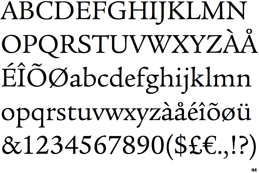
The upper-case 'Q' tail touches the circle.
|
 |
The upper-case 'J' descends below the baseline.
|
 |
The '4' is closed.
|
 |
The top storey of the '3' is a smooth curve.
|
 |
The top of the upper-case 'W' has four upper terminals.
|
 |
The lower-case 'e' has a straight angled bar.
|
 |
The top vertices of the upper-case 'M' have symmetrical single-sided serifs.
|
 |
The bar of the '4' crosses the vertical.
|
Note that the fonts in the icons shown above represent general examples, not necessarily the two fonts chosen for comparison.
Show Examples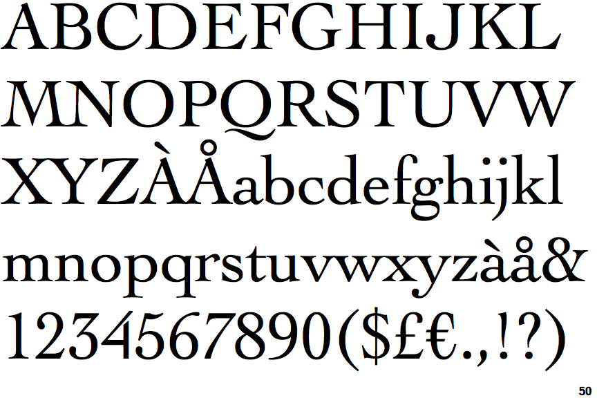
 |
The upper-case 'Q' tail is below and separated from the circle.
|
 |
The upper-case 'J' sits on the baseline.
|
 |
The '4' is open.
|
 |
The top storey of the '3' is a sharp angle.
|
 |
The top of the upper-case 'W' has three upper terminals.
|
 |
The lower-case 'e' has a straight horizontal bar.
|
 |
The top vertices of the upper-case 'M' have symmetrical double-sided serifs.
|
 |
The bar of the '4' does not cross the vertical.
|