 |
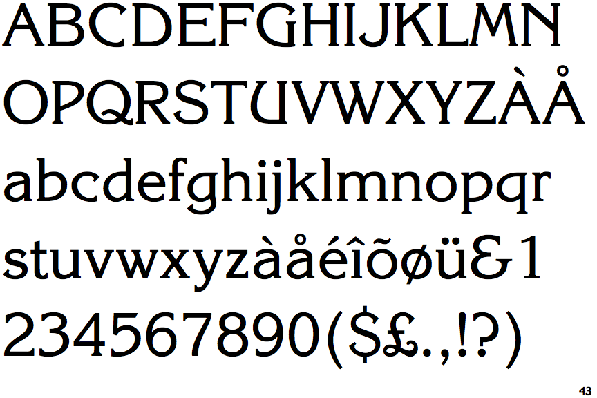
The '$' (dollar) has a single line which does not cross the 'S'.
|
 |
The '&' (ampersand) looks like 'Et' with a gap at the top.
|
 |
The upper-case 'U' has a stem/serif.
|
 |
The upper-case 'G' foot has a forward pointing spur or serif.
|
 |
The top of the lower-case 'q' has a right-facing serif.
|
 |
The tail of the upper-case 'J' has a flat end or cusp.
|
 |
The bar of the upper-case 'G' is double-sided.
|
 |
The lower-case 'e' has a straight horizontal bar.
|
 |
The stroke of the lower-case 'c' has a flat end or downward-pointing serif.
|
 |
The tail of the upper-case 'Q' is S-shaped.
|
There are more than ten differences; only the first ten are shown.
Note that the fonts in the icons shown above represent general examples, not necessarily the two fonts chosen for comparison.
Show Examples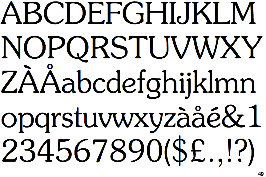
 |
The '$' (dollar) has a single line crossing the 'S'.
|
 |
The '&' (ampersand) is traditional style with two enclosed loops.
|
 |
The upper-case 'U' has no stem/serif.
|
 |
The upper-case 'G' foot has no spur or serif.
|
 |
The top of the lower-case 'q' has a vertical or slightly angled spur (pointed or flat).
|
 |
The tail of the upper-case 'J' has a rounded end or ball.
|
 |
The bar of the upper-case 'G' is single-sided, left-facing.
|
 |
The lower-case 'e' has a curved bar with no straight segment.
|
 |
The stroke of the lower-case 'c' has a rounded end or ball.
|
 |
The tail of the upper-case 'Q' is curved.
|