 |
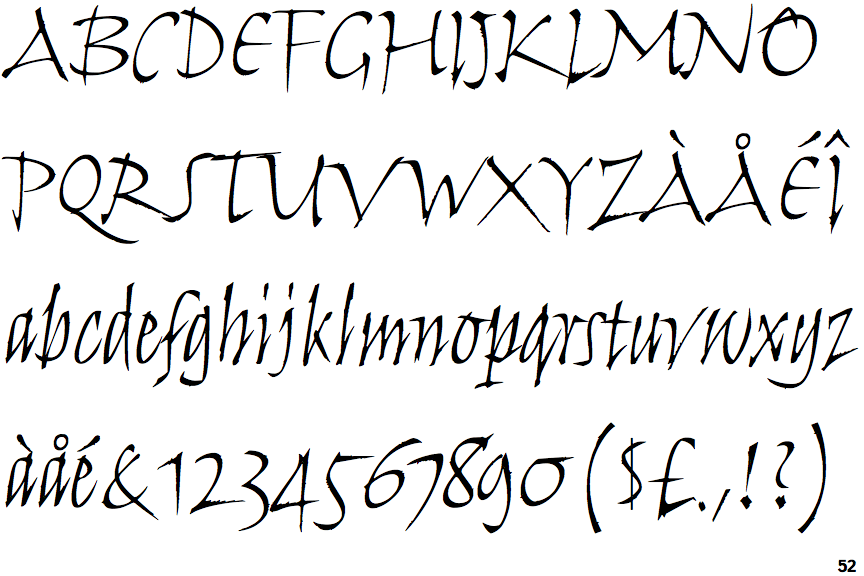
The upper-case 'J' sits on the baseline.
|
 |
The centre vertex of the upper-case 'M' is above the baseline.
|
 |
The leg of the upper-case 'R' is straight.
|
 |
The upper-case 'E' is drawn as a 'C' with a bar.
|
 |
The strokes are upright.
|
 |
The sides of the lower-case 'y' are parallel (U-shaped).
|
 |
The tail of the upper-case 'T' curves to the right.
|
 |
The tail of the lower-case 'y' curves or points to the left without a loop.
|
 |
The lower-case letters are separate.
|
Note that the fonts in the icons shown above represent general examples, not necessarily the two fonts chosen for comparison.
Show Examples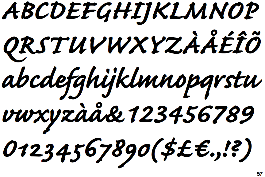
 |
The upper-case 'J' descends below the baseline.
|
 |
The centre vertex of the upper-case 'M' is on the baseline.
|
 |
The leg of the upper-case 'R' is curved inwards.
|
 |
The upper-case 'E' is normal letter shape.
|
 |
The strokes are sloped right (italic, oblique, or cursive).
|
 |
The sides of the lower-case 'y' are angled (V-shaped).
|
 |
The tail of the upper-case 'T' is straight.
|
 |
The tail of the lower-case 'y' is substantially straight.
|
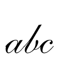 |
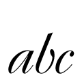
The lower-case letters are joined-up (flowing or cursive).
|