 |
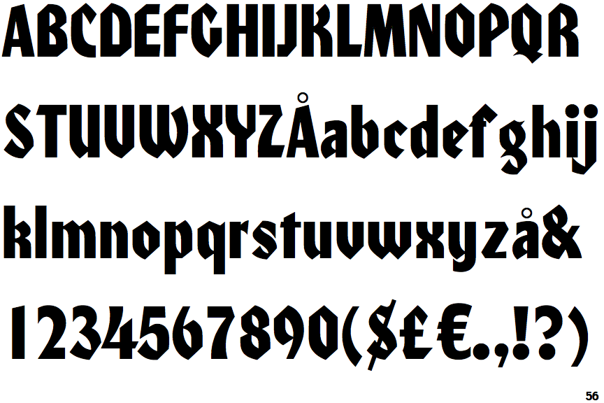
The upper-case 'Q' tail touches the circle.
|
 |
The '&' (ampersand) is traditional style with two enclosed loops.
|
 |
The characters do not have serifs.
|
 |
The '4' is open.
|
 |
The top storey of the '3' is a smooth curve.
|
 |
The upper-case 'U' has a stem/serif.
|
 |
The upper-case 'Y' arms and tail are separate strokes.
|
 |
The top of the lower-case 'q' has a vertical or slightly angled spur (pointed or flat).
|
 |
The sides of the lower-case 'y' are parallel (U-shaped).
|
 |
The lower-case 'e' has a straight angled bar.
|
Note that the fonts in the icons shown above represent general examples, not necessarily the two fonts chosen for comparison.
Show Examples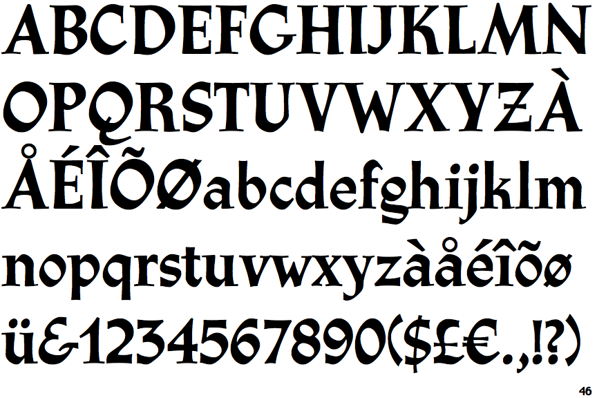
 |
The upper-case 'Q' tail crosses the circle.
|
 |
The '&' (ampersand) looks like 'Et' with a gap at the top.
|
 |
The characters have serifs.
|
 |
The '4' is closed.
|
 |
The top storey of the '3' is a sharp angle.
|
 |
The upper-case 'U' has no stem/serif.
|
 |
The upper-case 'Y' right-hand arm forms a continuous stroke with the tail.
|
 |
The top of the lower-case 'q' has no spur or serif.
|
 |
The sides of the lower-case 'y' are angled (V-shaped).
|
 |
The lower-case 'e' has a straight horizontal bar.
|