Identifont

Fonts by Appearance

Fonts by Name

Fonts by Similarity

Fonts by Picture

Fonts by Designer/Publisher

Differences

TweetTweet Differences

Compare: and  

ITC Handel Gothic

ITC Handel Gothic

Et shaped
The '&' (ampersand) looks like 'Et' with one enclosed loop (with or without exit stroke).
V-shaped
The sides of the lower-case 'y' are angled (V-shaped).

Note that the fonts in the icons shown above represent general examples, not necessarily the two fonts chosen for comparison.

Show Examples
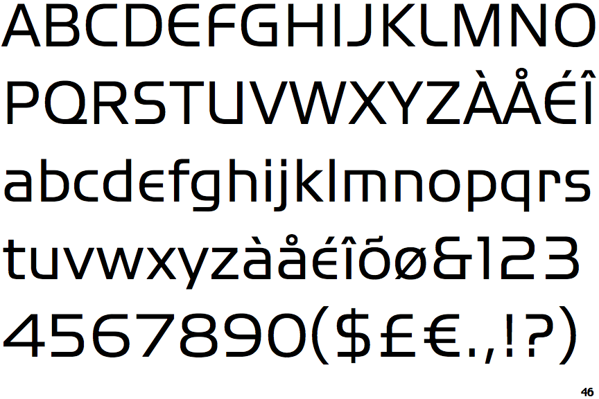
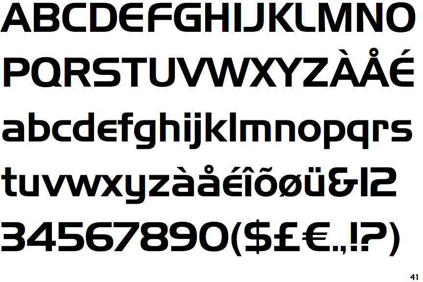
Handel Gothic (BT)

Handel Gothic (BT)

Gap top
The '&' (ampersand) looks like 'Et' with a gap at the top.
U-shaped
The sides of the lower-case 'y' are parallel (U-shaped).