 |
The verticals of the upper-case 'M' are sloping.
|
 |
The top of the upper-case 'W' has three upper terminals.
|
 |
The foot of the '4' has no serifs.
|
 |
The tail of the upper-case 'J' has a tapered end.
|
 |
The stroke of the lower-case 'c' has a flat end or downward-pointing serif.
|
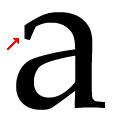 |
The loop of the lower-case 'a' has a flat end or cusp.
|
 |
The tail of the upper-case 'Q' is single-sided.
|
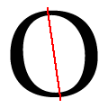 |
The axis of the upper-case 'O' is slanted to the left.
|
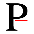 |
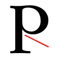
The base of the upper-case 'P' bowl is substantially horizontal.
|
Note that the fonts in the icons shown above represent general examples, not necessarily the two fonts chosen for comparison.
Show Examples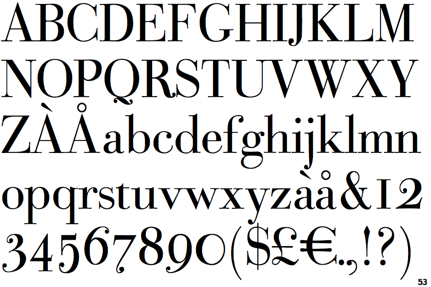
 |
The verticals of the upper-case 'M' are parallel.
|
 |
The top of the upper-case 'W' has four upper terminals.
|
 |
The foot of the '4' has double-sided serifs.
|
 |
The tail of the upper-case 'J' has a rounded end or ball.
|
 |
The stroke of the lower-case 'c' has a rounded end or ball.
|
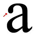 |
The loop of the lower-case 'a' has a ball or rounded end.
|
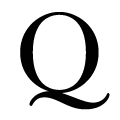 |
The tail of the upper-case 'Q' is double-sided.
|
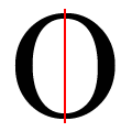 |
The axis of the upper-case 'O' is vertical or barely slanted.
|
 |
The base of the upper-case 'P' bowl is angled down.
|