 |
The diagonal strokes of the upper-case 'K' connect to the vertical via a horizontal bar.
|
 |
The centre bar of the upper-case 'P' leaves a gap with the vertical.
|
 |
The upper-case 'U' has a stem/serif.
|
 |
The upper-case 'G' foot has a forward pointing spur or serif.
|
 |
The tail of the upper-case 'J' has a tapered end.
|
 |
The centre vertex of the upper-case 'W' has no serifs.
|
 |
The lower-case 'e' has a straight angled bar.
|
 |
The stroke of the lower-case 'c' has a flat end or downward-pointing serif.
|
 |
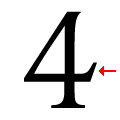
The bar of the '4' has no serifs or spur.
|
 |
The top vertices of the upper-case 'M' have no top serifs.
|
There are more than ten differences; only the first ten are shown.
Note that the fonts in the icons shown above represent general examples, not necessarily the two fonts chosen for comparison.
Show Examples
 |
The diagonal strokes of the upper-case 'K' meet at the vertical (with or without a gap).
|
 |
The centre bar of the upper-case 'P' meets the vertical.
|
 |
The upper-case 'U' has no stem/serif.
|
 |
The upper-case 'G' foot has no spur or serif.
|
 |
The tail of the upper-case 'J' has a rounded end or ball.
|
 |
The centre vertex of the upper-case 'W' has two separate serifs.
|
 |
The lower-case 'e' has a straight horizontal bar.
|
 |
The stroke of the lower-case 'c' has a rounded end or ball.
|
 |
The bar of the '4' has a single spur.
|
 |
The top vertices of the upper-case 'M' have symmetrical single-sided serifs.
|