 |
The upper-case 'Q' tail touches the circle.
|
 |
The '$' (dollar) has a single line which does not cross the 'S'.
|
 |
The lower-case 'g' is double-storey (with or without gap).
|
 |
The leg of the upper-case 'R' is straight.
|
 |
The '1' (digit one) has double-sided base or serifs.
|
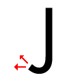 |
The tail of the upper-case 'J' points horizontally or slightly upwards.
|
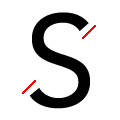 |
The ends of the upper-case 'S' stroke are angled.
|
Note that the fonts in the icons shown above represent general examples, not necessarily the two fonts chosen for comparison.
Show Examples
 |
The upper-case 'Q' tail crosses the circle.
|
 |
The '$' (dollar) has a single line crossing the 'S'.
|
 |
The lower-case 'g' is single-storey (with or without loop).
|
 |
The leg of the upper-case 'R' is curved outwards.
|
 |
The '1' (digit one) has no base.
|
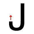 |
The tail of the upper-case 'J' points vertically.
|
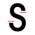 |
The ends of the upper-case 'S' stroke are horizontal or nearly horizontal.
|