Identifont

Fonts by Appearance

Fonts by Name

Fonts by Similarity

Fonts by Picture

Fonts by Designer/Publisher

Differences

TweetTweet Differences

Compare: and  

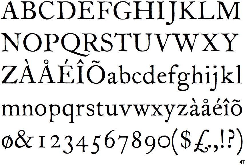
ITC Founder's Caslon 12

ITC Founder's Caslon 12

Single
The diagonal strokes of the upper-case 'K' meet at the vertical (with or without a gap).
None
The foot of the '4' has no serifs.
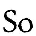
Corroded
The character outlines are corroded, roughened, or dirty.
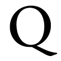
Single
The tail of the upper-case 'Q' is single-sided.

Note that the fonts in the icons shown above represent general examples, not necessarily the two fonts chosen for comparison.

Show Examples
Berthold Caslon Book

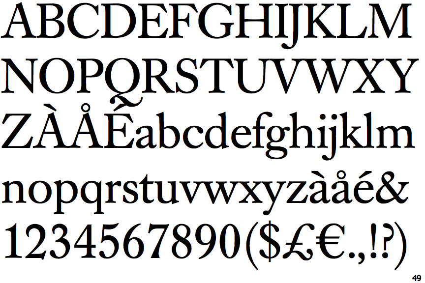
Berthold Caslon Book

Double
The diagonal strokes of the upper-case 'K' meet in a 'T'.
Double
The foot of the '4' has double-sided serifs.
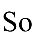
Smooth
The character outlines are smooth/sharp.
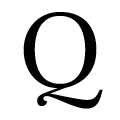
Z-Shaped
The tail of the upper-case 'Q' is Z-shaped.