 |
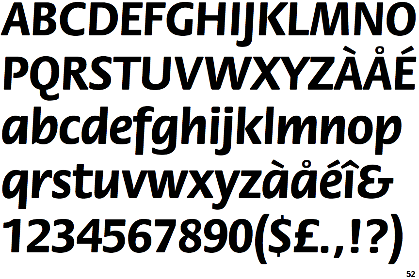
The '&' (ampersand) looks like 'Et' with a gap at the top.
|
 |
The upper-case 'J' descends below the baseline.
|
 |
The lower-case 'a' stem stops at the top of the bowl (single storey).
|
 |
The upper-case 'G' has no bar.
|
 |
The centre bar of the upper-case 'R' meets the vertical.
|
 |
The lower-case 'e' has a curved bar with no straight segment.
|
 |
The top of the upper-case 'W' has three upper terminals.
|
 |
The tail of the lower-case 'f' descends below the baseline.
|
Note that the fonts in the icons shown above represent general examples, not necessarily the two fonts chosen for comparison.
Show Examples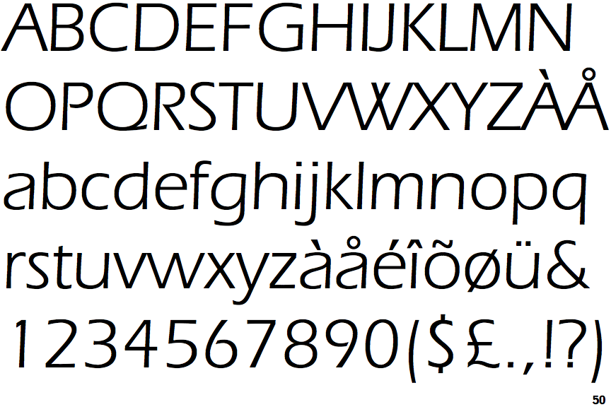
 |
The '&' (ampersand) is traditional style with a gap at the top.
|
 |
The upper-case 'J' sits on the baseline.
|
 |
The lower-case 'a' stem curves over the top of the bowl (double storey).
|
 |
The upper-case 'G' has a bar to the left.
|
 |
The centre bar of the upper-case 'R' leaves a gap with the vertical.
|
 |
The lower-case 'e' has a straight horizontal bar.
|
 |
The top of the upper-case 'W' has four upper terminals.
|
 |
The tail of the lower-case 'f' sits on the baseline.
|