 |
The upper-case 'Q' tail forms part of the stroke of an open circle.
|
 |
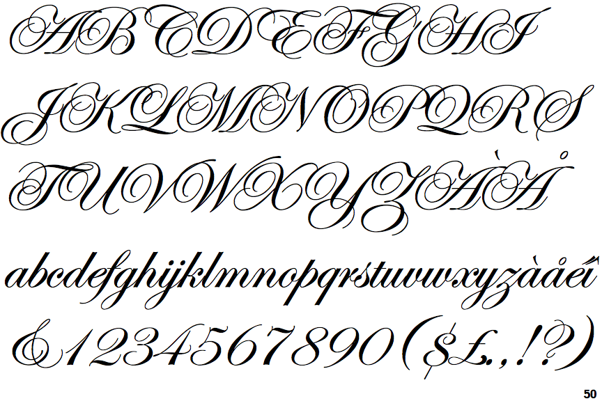
The lower-case 'z' is double-storey.
|
 |
The stroke of the 'l' (lower-case 'L') has no loop.
|
 |
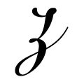
The bowl of the lower-case 'b' has no gap.
|
 |
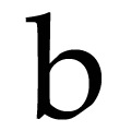
The stroke of the 'b' has no loop.
|
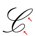 |
The upper-case 'C' has upper and lower loops.
|
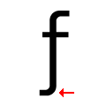 |
The tail of the lower-case 'f' curves or loops to the left.
|
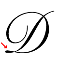 |
The upper-case 'D' has no lower loop.
|
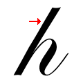 |
The stroke of the lower-case 'h' has no loop.
|
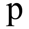 |
The bowl of the lower-case 'p' has no gap.
|
There are more than ten differences; only the first ten are shown.
Note that the fonts in the icons shown above represent general examples, not necessarily the two fonts chosen for comparison.
Show Examples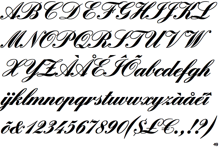
 |
The upper-case 'Q' tail crosses the circle.
|
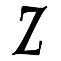 |
The lower-case 'z' is single-storey without a bar.
|
 |
The stroke of the 'l' (lower-case 'L') has a loop.
|
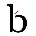 |
The bowl of the lower-case 'b' has an upper gap.
|
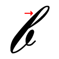 |
The stroke of the 'b' has a loop.
|
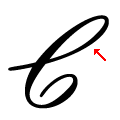 |
The upper-case 'C' has only an upper loop with no curl.
|
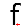 |
The tail of the lower-case 'f' is straight.
|
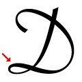 |
The upper-case 'D' has a lower loop.
|
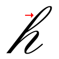 |
The stroke of the lower-case 'h' has a loop.
|
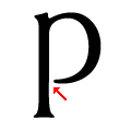 |
The bowl of the lower-case 'p' has a lower gap.
|