 |
The diagonal strokes of the upper-case 'K' meet in a 'T'.
|
 |
The centre vertex of the upper-case 'M' is on the baseline.
|
 |
The dot on the '?' (question-mark) is circular or oval.
|
|
The verticals of the upper-case 'M' are parallel.
|
 |
The top storey of the '3' is a smooth curve.
|
 |
The upper-case 'Y' arms and tail are separate strokes.
|
 |
The tail of the upper-case 'J' has a rounded end or ball.
|
 |
The centre vertex of the upper-case 'W' has two separate serifs.
|
 |
The bar of the '4' has no serifs or spur.
|
 |
The top vertices of the upper-case 'M' have symmetrical single-sided serifs.
|
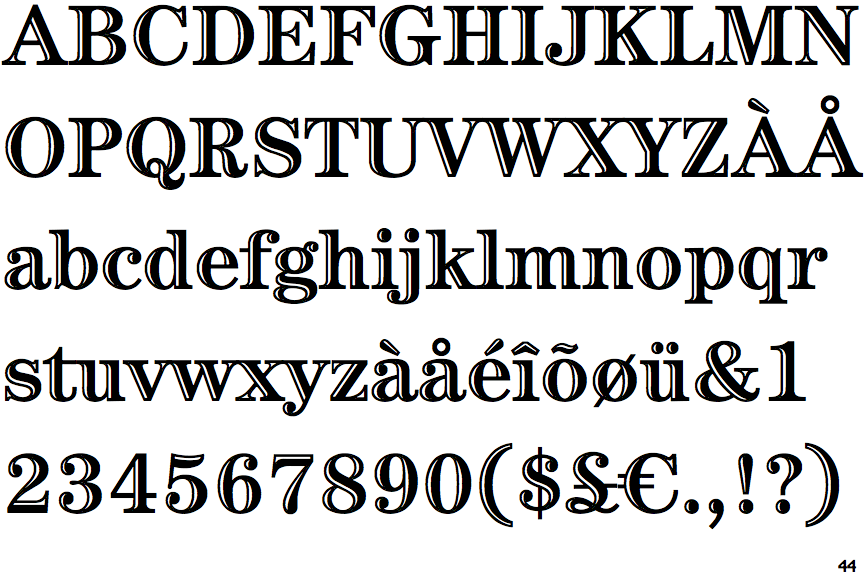
There are more than ten differences; only the first ten are shown.
Note that the fonts in the icons shown above represent general examples, not necessarily the two fonts chosen for comparison.
Show Examples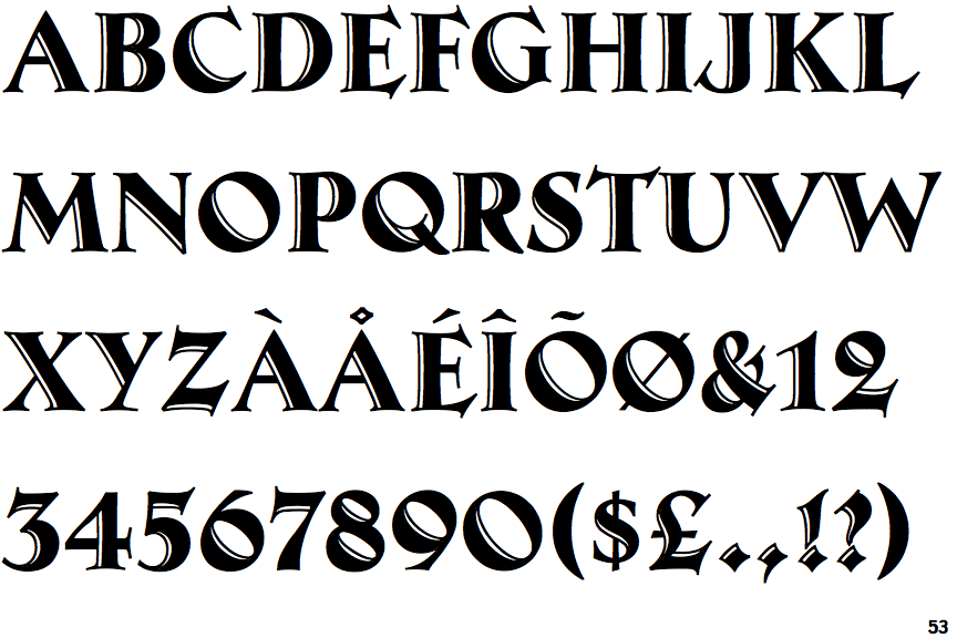
 |
The diagonal strokes of the upper-case 'K' meet at the vertical (with or without a gap).
|
 |
The centre vertex of the upper-case 'M' is above the baseline.
|
 |
The dot on the '?' (question-mark) is diamond-shaped or triangular.
|
 |
The verticals of the upper-case 'M' are sloping.
|
 |
The top storey of the '3' is a sharp angle.
|
 |
The upper-case 'Y' right-hand arm forms a continuous stroke with the tail.
|
 |
The tail of the upper-case 'J' has a flat end or cusp.
|
 |
The centre vertex of the upper-case 'W' has no serifs.
|
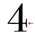 |
The bar of the '4' has double serifs.
|
 |
The top vertices of the upper-case 'M' have symmetrical double-sided serifs.
|