Identifont

Fonts by Appearance

Fonts by Name

Fonts by Similarity

Fonts by Picture

Fonts by Designer/Publisher

Differences

TweetTweet Differences

Compare: and  

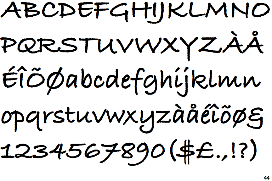
ITC Bradley Hand Bold

ITC Bradley Hand Bold

Gap top
The '&' (ampersand) looks like 'Et' with a gap at the top.
Open
The '4' is open.
Above
The centre vertex of the upper-case 'M' is above the baseline.
Crosses
The centre bar of the upper-case 'P' crosses the vertical.
Open
The centre bar of the upper-case 'R' leaves a gap with the vertical.

Note that the fonts in the icons shown above represent general examples, not necessarily the two fonts chosen for comparison.

Show Examples
Bradley Type Heavy

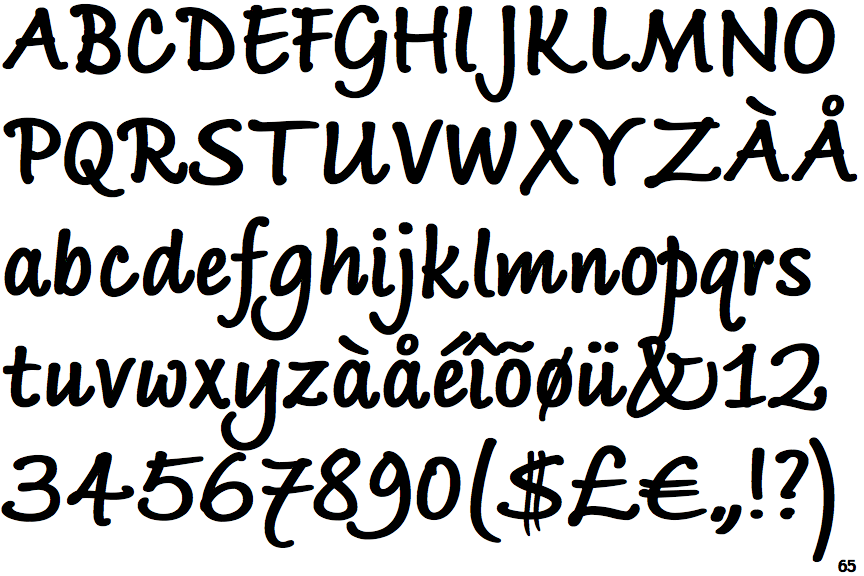
Bradley Type Heavy

Closed
The '&' (ampersand) is traditional style with two enclosed loops.
Closed
The '4' is closed.
Baseline
The centre vertex of the upper-case 'M' is on the baseline.
Meets
The centre bar of the upper-case 'P' meets the vertical.
Closed
The centre bar of the upper-case 'R' meets the vertical.