 |
The upper-case 'J' descends below the baseline.
|
 |
The '4' is closed.
|
 |
The upper-case 'G' foot has no spur or serif.
|
 |
The top of the lower-case 'q' has a vertical or slightly angled spur (pointed or flat).
|
 |
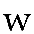
The top of the upper-case 'W' has four upper terminals.
|
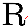 |
The leg of the upper-case 'R' has a vertical or almost vertical spur.
|
 |
The centre vertex of the lower-case 'w' has no centre serifs.
|
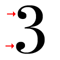 |
The '3' strokes are both terminated with balls.
|
 |
The foot of the '£' (pound) has no open loop.
|
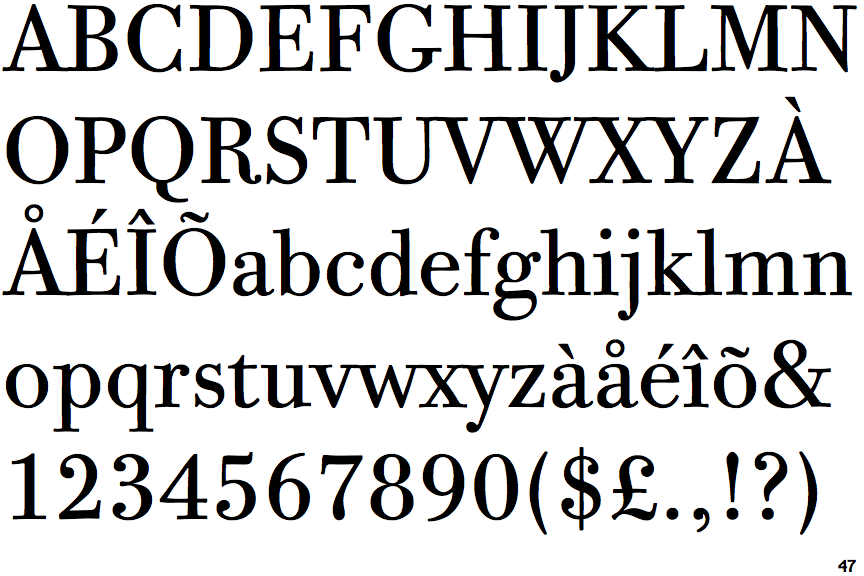
Note that the fonts in the icons shown above represent general examples, not necessarily the two fonts chosen for comparison.
Show Examples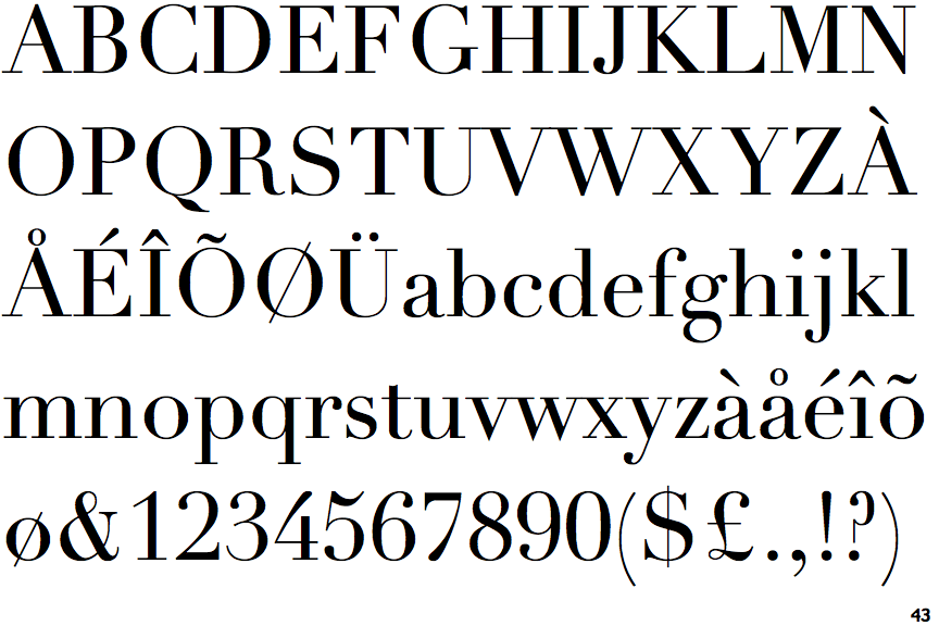
 |
The upper-case 'J' sits on the baseline.
|
 |
The '4' is open.
|
 |
The upper-case 'G' foot has a downward pointing spur.
|
 |
The top of the lower-case 'q' has a right-facing serif.
|
 |
The top of the upper-case 'W' has three upper terminals.
|
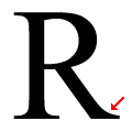 |
The leg of the upper-case 'R' has a single right-pointing serif or foot.
|
 |
The centre vertex of the lower-case 'w' has distinct centre serifs.
|
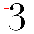 |
The '3' strokes are terminated with a ball at the top, plain at the bottom.
|
 |
The foot of the '£' (pound) has an open loop.
|