Identifont

Fonts by Appearance

Fonts by Name

Fonts by Similarity

Fonts by Picture

Fonts by Designer/Publisher

Differences

TweetTweet Differences

Compare: and  

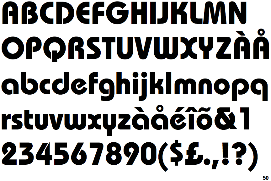
ITC Bauhaus Bold

ITC Bauhaus Bold

Open
The '&' (ampersand) is traditional style with a gap at the top.
Sloping
The verticals of the upper-case 'M' are sloping.
Angled
The top storey of the '3' is a sharp angle.
Gap
The centre bar of the upper-case 'P' leaves a gap with the vertical.
Three
The upper-case 'Y' arms and tail are separate strokes.

Note that the fonts in the icons shown above represent general examples, not necessarily the two fonts chosen for comparison.

Show Examples
EF Expressa

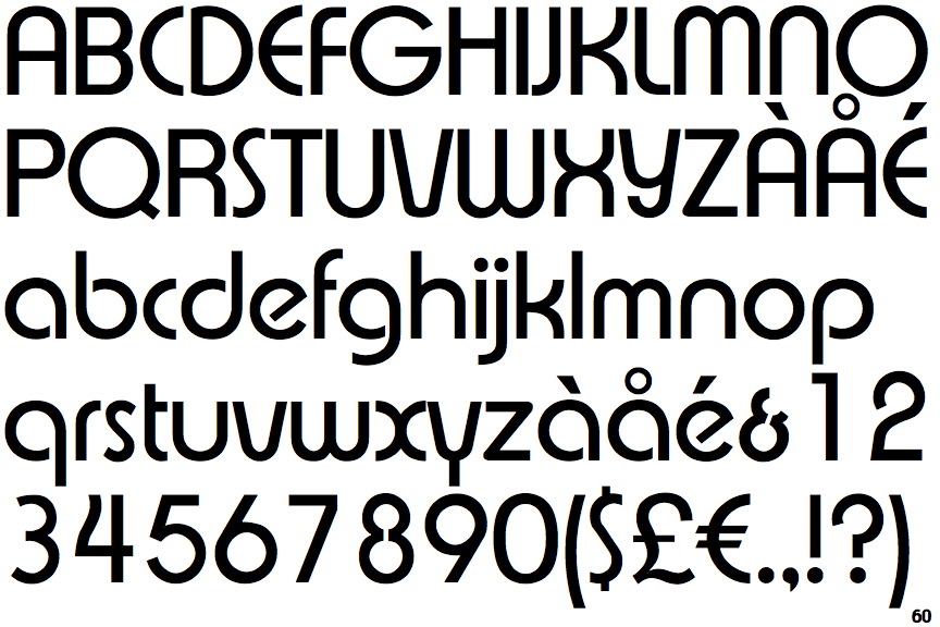
EF Expressa

Gap top
The '&' (ampersand) looks like 'Et' with a gap at the top.
Parallel
The verticals of the upper-case 'M' are parallel.
Round
The top storey of the '3' is a smooth curve.
Meets
The centre bar of the upper-case 'P' meets the vertical.
Two
The upper-case 'Y' right-hand arm forms a continuous stroke with the tail.