Identifont

Fonts by Appearance

Fonts by Name

Fonts by Similarity

Fonts by Picture

Fonts by Designer/Publisher

Differences

TweetTweet Differences

Compare: and  

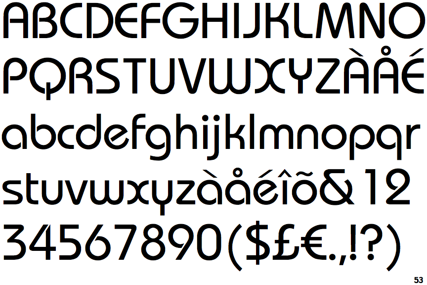
ITC Bauhaus (EF)

ITC Bauhaus (EF)

Parallel
The upper-case 'A' has parallel verticals.
Open
The centre bar of the upper-case 'R' leaves a gap with the vertical.
Curved
The right side of the upper-case 'G' is curved.
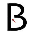
Gap
The centre bar of the upper-case 'B' leaves a gap with the vertical.

Note that the fonts in the icons shown above represent general examples, not necessarily the two fonts chosen for comparison.

Show Examples
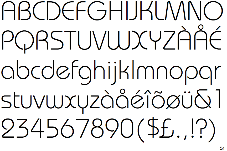
ITC Bauhaus Light

ITC Bauhaus Light

Tapered
The upper-case 'A' has tapered verticals.
Closed
The centre bar of the upper-case 'R' meets the vertical.
Flat
The right side of the upper-case 'G' has a flat section.
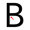
Meets
The centre bar of the upper-case 'B' meets the vertical.