 |
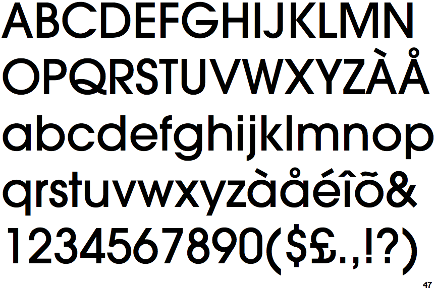
The '$' (dollar) has a single line which does not cross the 'S'.
|
 |
The '&' (ampersand) is traditional style with two enclosed loops.
|
 |
The upper-case 'J' sits on the baseline.
|
 |
The dot on the '?' (question-mark) is square or rectangular.
|
 |
The 'l' (lower-case 'L') has no serifs or tail.
|
 |
The leg of the upper-case 'R' is straight.
|
 |
The upper-case 'A' has tapered verticals.
|
 |
The sides of the lower-case 'y' are angled (V-shaped).
|
 |
The dot on the lower-case 'i' or 'j' is square or rectangular.
|
 |
The bar of the lower-case 'f' is double-sided.
|
There are more than ten differences; only the first ten are shown.
Note that the fonts in the icons shown above represent general examples, not necessarily the two fonts chosen for comparison.
Show Examples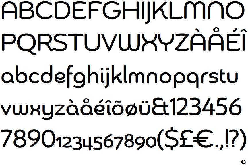
 |
The '$' (dollar) has a single line crossing the 'S'.
|
 |
The '&' (ampersand) is traditional style with a gap at the top.
|
 |
The upper-case 'J' descends below the baseline.
|
 |
The dot on the '?' (question-mark) is circular or oval.
|
 |
The 'l' (lower-case 'L') has a right-facing lower serif or tail.
|
 |
The leg of the upper-case 'R' is curved inwards.
|
 |
The upper-case 'A' has parallel verticals.
|
 |
The sides of the lower-case 'y' are parallel (U-shaped).
|
 |
The dot on the lower-case 'i' or 'j' is circular or oval.
|
 |
The bar of the lower-case 'f' is single-sided.
|