 |
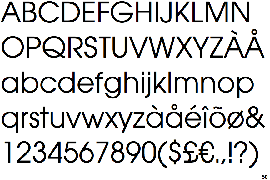
The '&' (ampersand) is traditional style with two enclosed loops.
|
 |
The diagonal strokes of the upper-case 'K' meet in a 'T'.
|
 |
The dot on the '?' (question-mark) is square or rectangular.
|
 |
The verticals of the upper-case 'M' are parallel.
|
 |
The leg of the upper-case 'R' is straight.
|
 |
The right side of the upper-case 'G' is curved.
|
 |
The dot on the lower-case 'i' or 'j' is square or rectangular.
|
 |
The tail of the upper-case 'Q' is curved or S-shaped.
|
 |
The lower-case 't' has double-sided bar which forms a right-angle with the vertical.
|
 |
The centre strokes of the upper-case 'W' meet at a vertex.
|
There are more than ten differences; only the first ten are shown.
Note that the fonts in the icons shown above represent general examples, not necessarily the two fonts chosen for comparison.
Show Examples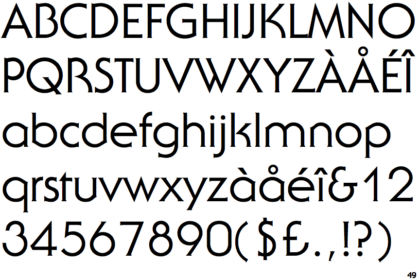
 |
The '&' (ampersand) looks like 'Et' with a gap at the top.
|
 |
The diagonal strokes of the upper-case 'K' meet at the vertical (with or without a gap).
|
 |
The dot on the '?' (question-mark) is circular or oval.
|
 |
The verticals of the upper-case 'M' are sloping.
|
 |
The leg of the upper-case 'R' is curved outwards.
|
 |
The right side of the upper-case 'G' has a flat section.
|
 |
The dot on the lower-case 'i' or 'j' is circular or oval.
|
 |
The tail of the upper-case 'Q' is straight.
|
 |
The lower-case 't' has double-sided bar which forms a diagonal with the vertical.
|
 |
The centre strokes of the upper-case 'W' meet in a T on the left.
|