 |
The upper-case 'Q' tail is below and separated from the circle.
|
 |
The '$' (dollar) has a single line crossing the 'S'.
|
 |
The '4' is open.
|
 |
The centre bar of the upper-case 'P' crosses the vertical.
|
 |
The lower-case 'g' is single-storey (with or without loop).
|
 |
The lower-case 'a' stem stops at the top of the bowl (single storey).
|
 |
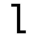
The 'l' (lower-case 'L') has a right-facing lower serif or tail.
|
 |
The leg of the upper-case 'R' is curved inwards.
|
 |
The upper-case 'E' is drawn as a 'C' with a bar.
|
 |
The centre bar of the upper-case 'R' crosses the vertical.
|
There are more than ten differences; only the first ten are shown.
Note that the fonts in the icons shown above represent general examples, not necessarily the two fonts chosen for comparison.
Show Examples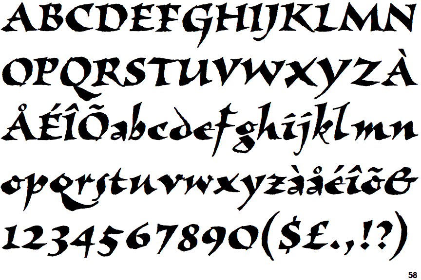
 |
The upper-case 'Q' tail touches the circle.
|
 |
The '$' (dollar) has a single line which does not cross the 'S'.
|
 |
The '4' is closed.
|
 |
The centre bar of the upper-case 'P' meets the vertical.
|
 |
The lower-case 'g' is double-storey (with or without gap).
|
 |
The lower-case 'a' stem curves over the top of the bowl (double storey).
|
 |
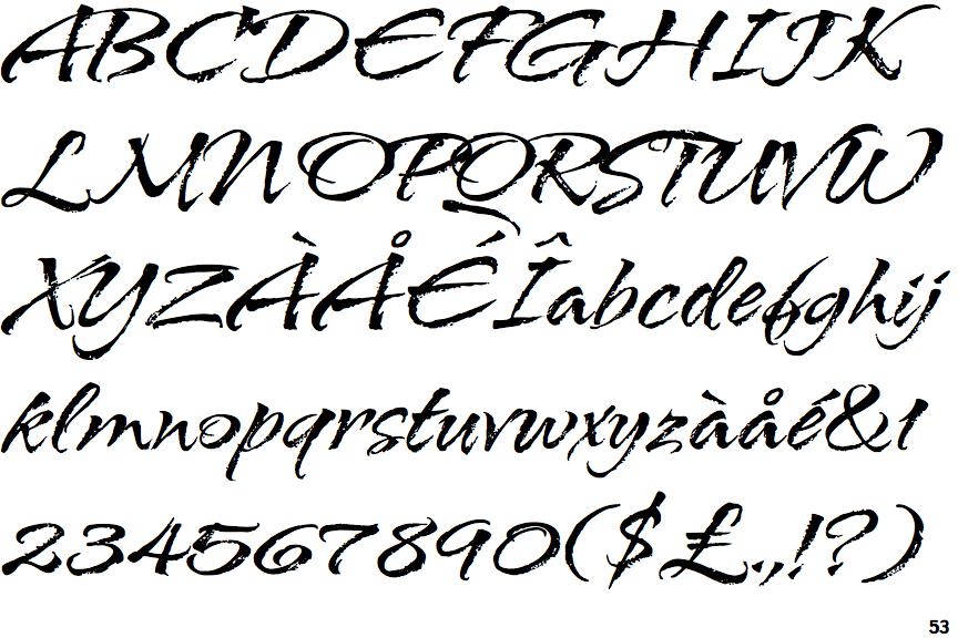
The 'l' (lower-case 'L') has a left-facing upper serif and right-facing lower serif or tail.
|
 |
The leg of the upper-case 'R' is straight.
|
 |
The upper-case 'E' is normal letter shape.
|
 |
The centre bar of the upper-case 'R' meets the vertical.
|