 |
The upper-case 'Q' tail touches the circle.
|
 |
The '&' (ampersand) looks like 'Et' with one enclosed loop (with or without exit stroke).
|
 |
The centre vertex of the upper-case 'M' is on the baseline.
|
 |
The dot on the '?' (question-mark) is square or rectangular.
|
 |
The top storey of the '3' is a smooth curve.
|
 |
The centre bar of the upper-case 'R' crosses the vertical.
|
 |
The bar of the upper-case 'H' is below centre.
|
 |
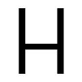
The centre bar of the upper-case 'B' crosses the vertical.
|
 |
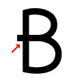
The bar of the upper-case 'A' crosses the left vertical.
|
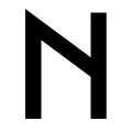 |
The upper-case 'N' vertices are pointed at the top, flat at the bottom.
|
There are more than ten differences; only the first ten are shown.
Note that the fonts in the icons shown above represent general examples, not necessarily the two fonts chosen for comparison.
Show Examples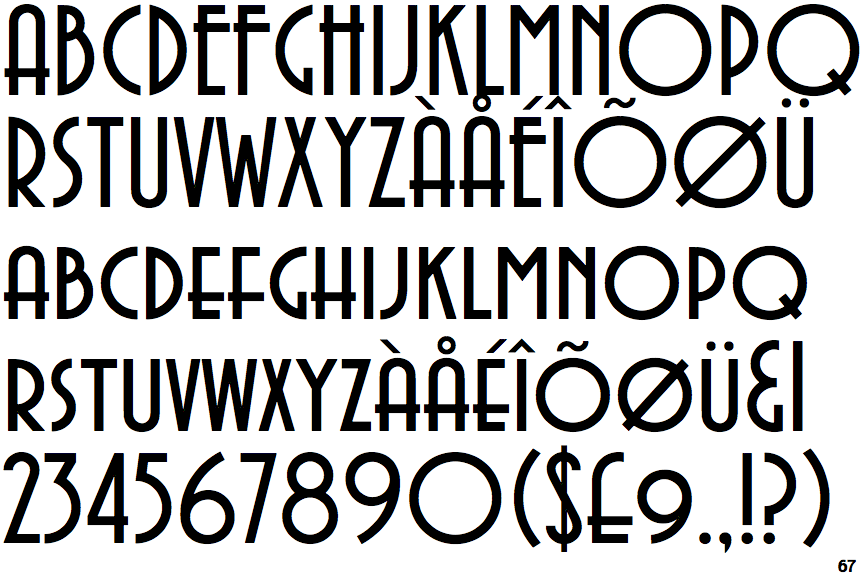
 |
The upper-case 'Q' tail crosses the circle.
|
 |
The '&' (ampersand) looks like 'Et' with a gap at the top.
|
 |
The centre vertex of the upper-case 'M' is above the baseline.
|
 |
The dot on the '?' (question-mark) is circular or oval.
|
 |
The top storey of the '3' is a sharp angle.
|
 |
The centre bar of the upper-case 'R' meets the vertical.
|
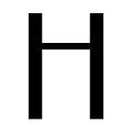 |
The bar of the upper-case 'H' is above centre.
|
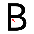 |
The centre bar of the upper-case 'B' meets the vertical.
|
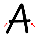 |
The bar of the upper-case 'A' crosses both verticals.
|
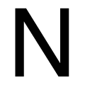 |
The upper-case 'N' vertices are flat at the top and bottom.
|