 |
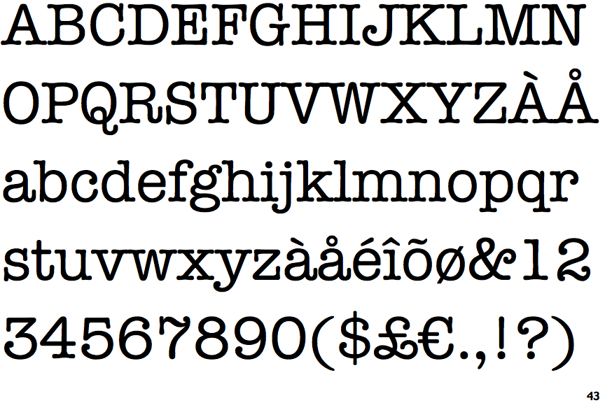
The dot on the '?' (question-mark) is circular or oval.
|
 |
The top storey of the '3' is a sharp angle.
|
 |
The lower-case 'g' is double-storey (with or without gap).
|
 |
The top of the upper-case 'A' has no serifs or cusps.
|
 |
The centre bar of the upper-case 'E' has serifs.
|
 |
The top of the lower-case 'q' has a vertical or slightly angled spur (pointed or flat).
|
 |
The bar of the upper-case 'G' is double-sided.
|
 |
The dot on the lower-case 'i' or 'j' is circular or oval.
|
 |
The centre bar of the upper-case 'F' has serifs.
|
 |
The stroke of the lower-case 'c' has a rounded end or ball.
|
There are more than ten differences; only the first ten are shown.
Note that the fonts in the icons shown above represent general examples, not necessarily the two fonts chosen for comparison.
Show Examples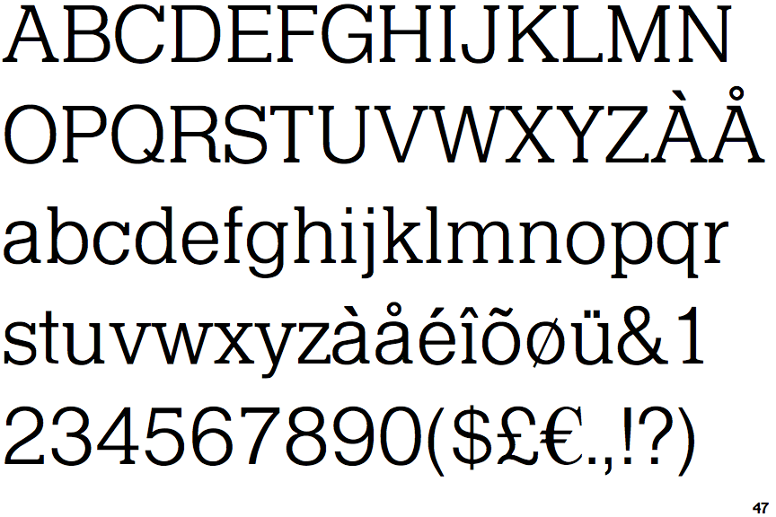
 |
The dot on the '?' (question-mark) is square or rectangular.
|
 |
The top storey of the '3' is a smooth curve.
|
 |
The lower-case 'g' is single-storey (with or without loop).
|
 |
The top of the upper-case 'A' has a serif or cusp on the left.
|
 |
The centre bar of the upper-case 'E' has no serifs.
|
 |
The top of the lower-case 'q' has a right-facing serif.
|
 |
The bar of the upper-case 'G' is single-sided, left-facing.
|
 |
The dot on the lower-case 'i' or 'j' is square or rectangular.
|
 |
The centre bar of the upper-case 'F' has no serifs.
|
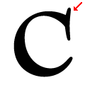 |
The stroke of the lower-case 'c' has an upward-pointing serif.
|