Identifont

Fonts by Appearance

Fonts by Name

Fonts by Similarity

Fonts by Picture

Fonts by Designer/Publisher

Differences

TweetTweet Differences

Compare: and  

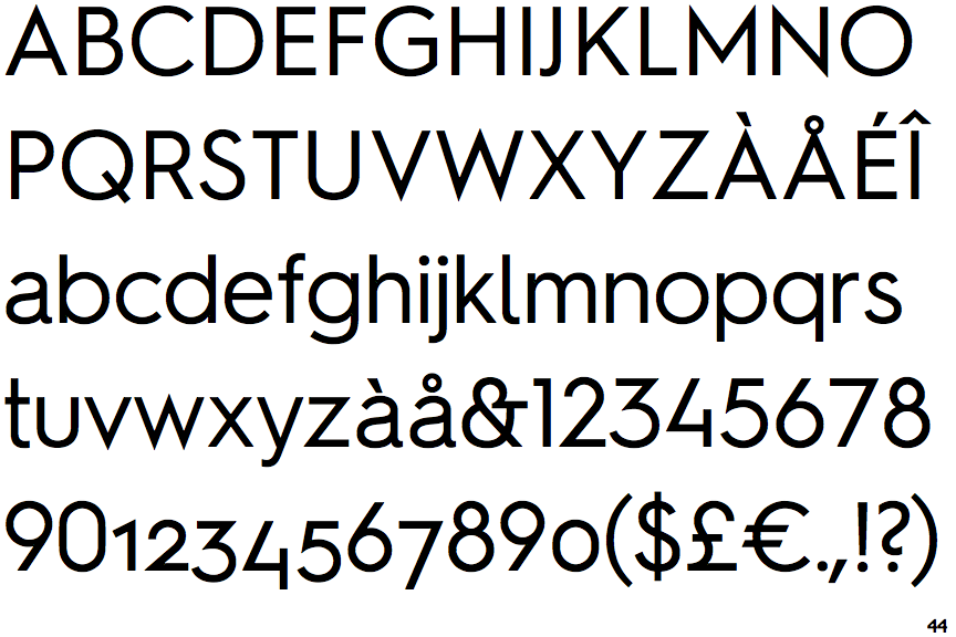
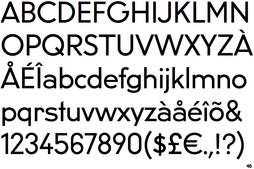
Hurme Geometric Sans 2

Hurme Geometric Sans 2

Angled
The top storey of the '3' is a sharp angle.
Right
The 'l' (lower-case 'L') has a right-facing lower serif or tail.
Flat
The right side of the upper-case 'G' has a flat section.
No-Stem
The lower-case 'u' has no stem/serif.
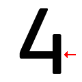
Touches
The bar of the '4' does not cross the vertical.
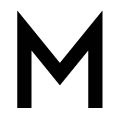
Pointed-Pointed
The upper-case 'M' vertices are pointed at the top and bottom.

Note that the fonts in the icons shown above represent general examples, not necessarily the two fonts chosen for comparison.

Show Examples
U8

U8

Round
The top storey of the '3' is a smooth curve.
Plain
The 'l' (lower-case 'L') has no serifs or tail.
Curved
The right side of the upper-case 'G' is curved.
Stem
The lower-case 'u' has a stem/serif.
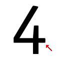
Crosses
The bar of the '4' crosses the vertical.
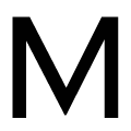
Flat-Pointed
The upper-case 'M' vertices are flat at the top, pointed at the bottom.