 |
The upper-case 'Q' tail touches the circle.
|
 |
The lower-case 'g' is single-storey (with or without loop).
|
 |
The upper-case 'A' has parallel verticals.
|
 |
The top of the lower-case 'q' has no spur or serif.
|
 |
The tail of the lower-case 'y' is curved or U-shaped to the left.
|
 |
The lower-case 'u' has no stem/serif.
|
 |
The '1' (digit one) has double-sided base or serifs.
|
 |
The top of the '7' has a downward-pointing serif or bar.
|
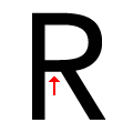 |
The leg of the upper-case 'R' is separated from the vertical by a distinct horizontal section.
|
 |
The centre strokes of the upper-case 'W' form one centre stroke.
|
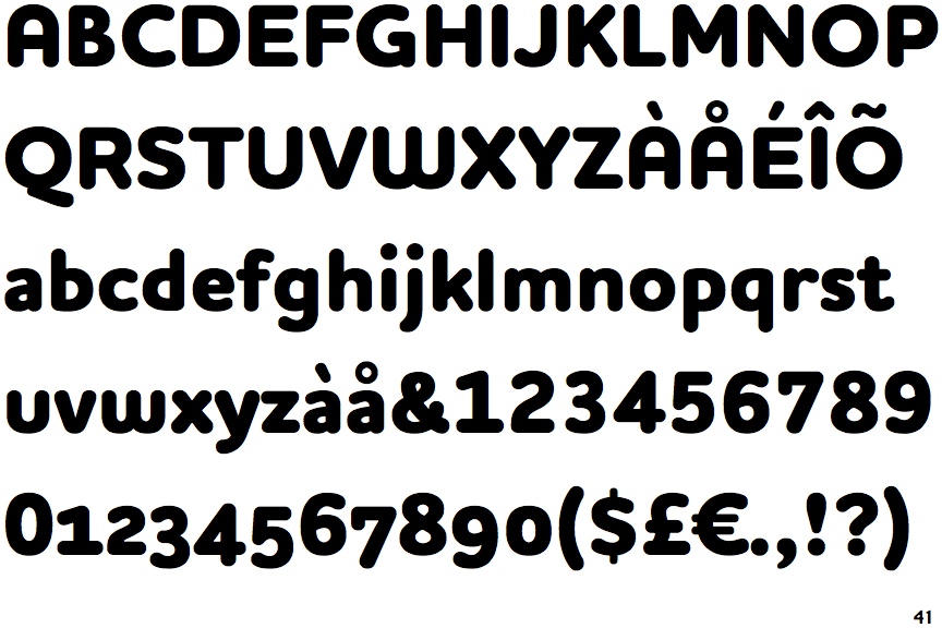
There are more than ten differences; only the first ten are shown.
Note that the fonts in the icons shown above represent general examples, not necessarily the two fonts chosen for comparison.
Show Examples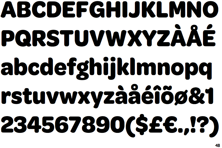
 |
The upper-case 'Q' tail crosses the circle.
|
 |
The lower-case 'g' is double-storey (with or without gap).
|
 |
The upper-case 'A' has tapered verticals.
|
 |
The top of the lower-case 'q' has a vertical or slightly angled spur (pointed or flat).
|
 |
The tail of the lower-case 'y' is substantially straight.
|
 |
The lower-case 'u' has a stem/serif.
|
 |
The '1' (digit one) has no base.
|
 |
The top of the '7' has no serif or bar.
|
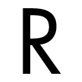 |
The leg of the upper-case 'R' meets the vertical.
|
 |
The centre strokes of the upper-case 'W' meet at a vertex.
|