 |
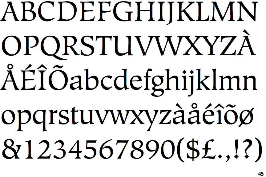
The diagonal strokes of the upper-case 'K' meet in a 'T'.
|
 |
The dot on the '?' (question-mark) is diamond-shaped or triangular.
|
 |
The upper-case 'U' has a stem/serif.
|
 |
The top of the upper-case 'A' has a serif or cusp on the left.
|
 |
The centre bar of the upper-case 'R' meets the vertical.
|
 |
The centre vertex of the upper-case 'W' has two separate serifs.
|
 |
The dot on the lower-case 'i' or 'j' is diamond-shaped.
|
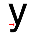 |
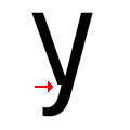
There is a smooth join at the junction of the lower-case 'y'.
|
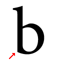 |
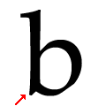
The lower-case 'b' has no lower spur, foot, or serif.
|
 |
The top stroke of the upper-case 'S' has a vertical or angled upward-pointing serif.
|
There are more than ten differences; only the first ten are shown.
Note that the fonts in the icons shown above represent general examples, not necessarily the two fonts chosen for comparison.
Show Examples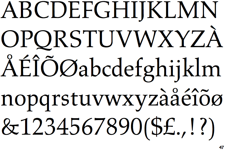
 |
The diagonal strokes of the upper-case 'K' meet at the vertical (with or without a gap).
|
 |
The dot on the '?' (question-mark) is circular or oval.
|
 |
The upper-case 'U' has no stem/serif.
|
 |
The top of the upper-case 'A' has no serifs or cusps.
|
 |
The centre bar of the upper-case 'R' leaves a gap with the vertical.
|
 |
The centre vertex of the upper-case 'W' has no serifs.
|
 |
The dot on the lower-case 'i' or 'j' is circular or oval.
|
 |
There is a break at the junction of the lower-case 'y'.
|
 |
The lower-case 'b' has a downward-pointing spur or foot (pointed or flat).
|
 |
The top stroke of the upper-case 'S' has no upward-pointing serif.
|