 |
The '&' (ampersand) looks like 'Et' with a gap at the top.
|
 |
The upper-case 'J' sits on the baseline.
|
 |
The lower-case 'g' is single-storey (with or without loop).
|
 |
The centre vertex of the upper-case 'W' has no serifs.
|
 |
The character outlines are smooth/sharp.
|
 |
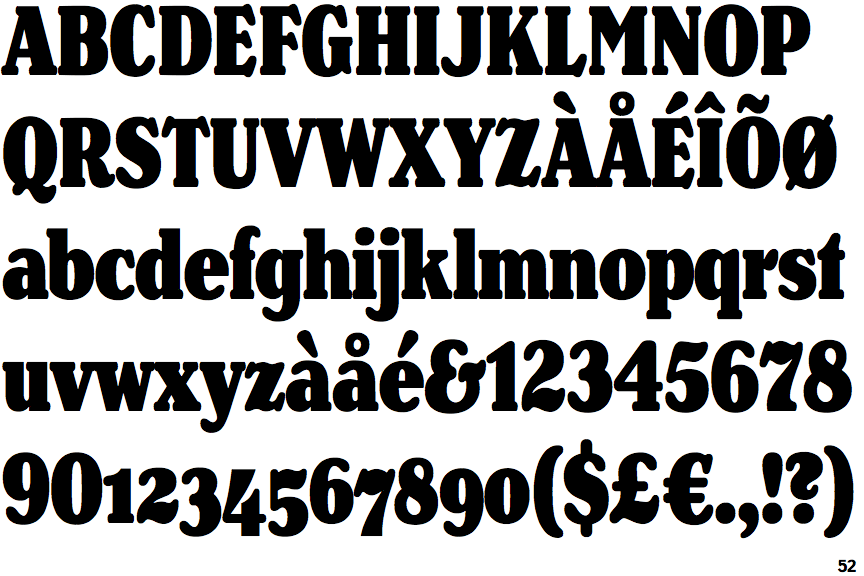
The top serif of the upper-case 'C' is angled left.
|
 |
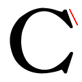
The tail of the upper-case 'Q' is double-sided.
|
Note that the fonts in the icons shown above represent general examples, not necessarily the two fonts chosen for comparison.
Show Examples
 |
The '&' (ampersand) is traditional style with two enclosed loops.
|
 |
The upper-case 'J' descends below the baseline.
|
 |
The lower-case 'g' is double-storey (with or without gap).
|
 |
The centre vertex of the upper-case 'W' has two separate serifs.
|
 |
The character outlines are corroded, roughened, or dirty.
|
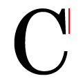 |
The top serif of the upper-case 'C' is vertical or nearly vertical.
|
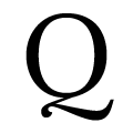 |
The tail of the upper-case 'Q' is Z-shaped.
|