Identifont

Fonts by Appearance

Fonts by Name

Fonts by Similarity

Fonts by Picture

Fonts by Designer/Publisher

Differences

TweetTweet Differences

Compare: and  

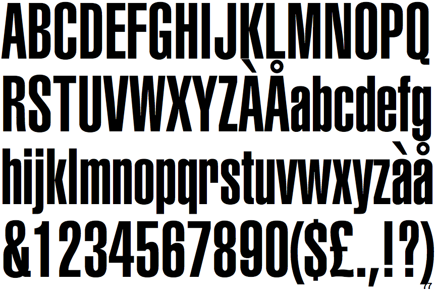
Helvetica Ultra Compressed

Helvetica Ultra Compressed

Closed
The '&' (ampersand) is traditional style with two enclosed loops.
Curved
The tail of the upper-case 'Q' is curved, S-shaped, or Z-shaped.
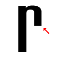
Downwards
The arm of the lower-case 'r' points downwards.
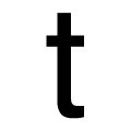
Curved
The tail of the lower-case 't' is curved.

Note that the fonts in the icons shown above represent general examples, not necessarily the two fonts chosen for comparison.

Show Examples
Block Gothic Extra Condensed

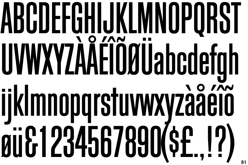
Block Gothic Extra Condensed

Gap top
The '&' (ampersand) looks like 'Et' with a gap at the top.
Straight
The tail of the upper-case 'Q' is straight (horizontal, diagonal, or vertical).
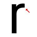
Upwards
The arm of the lower-case 'r' points upwards or slightly downwards.
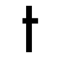
Straight
The tail of the lower-case 't' is straight.