Differences
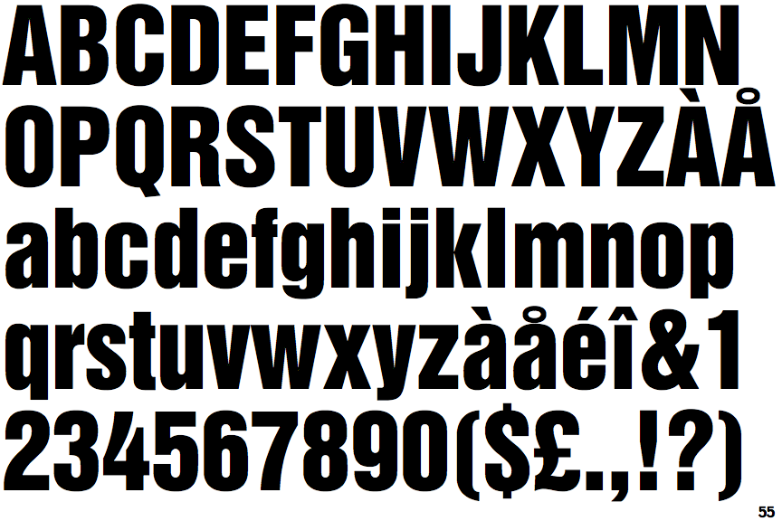
Helvetica Inserat
 |
The '4' is open.
|
 |
The lower-case 'a' stem curves over the top of the bowl (double storey).
|
 |
The upper-case 'G' has a spur/tail.
|
 |
The upper-case 'G' has a bar to the left.
|
 |
The upper-case 'A' has tapered verticals.
|
 |
The tail of the upper-case 'Q' is straight (horizontal, diagonal, or vertical).
|
 |
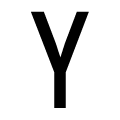
The tail of the lower-case 'y' is curved or U-shaped to the left.
|
 |
The lower-case 'u' has a stem/serif.
|
 |
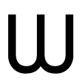
The centre strokes of the upper-case 'W' meet at a vertex.
|
Note that the fonts in the icons shown above represent general examples, not necessarily the two fonts chosen for comparison.
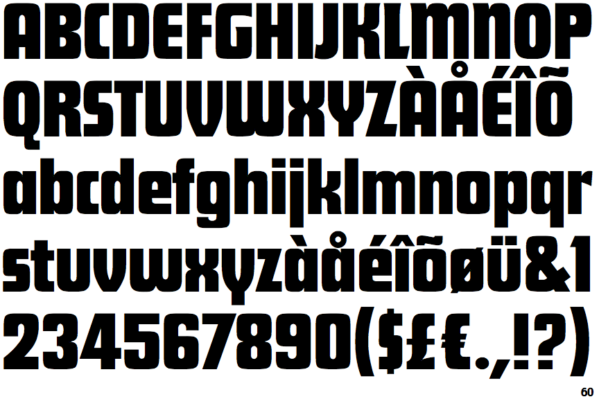
Show ExamplesFutura Display (URW)
 |
The '4' is closed.
|
 |
The lower-case 'a' stem stops at the top of the bowl (single storey).
|
 |
The upper-case 'G' has no spur/tail.
|
 |
The upper-case 'G' has no bar.
|
 |
The upper-case 'A' has parallel verticals.
|
 |
The tail of the upper-case 'Q' is curved, S-shaped, or Z-shaped.
|
 |
The tail of the lower-case 'y' is symmetrical.
|
 |
The lower-case 'u' has no stem/serif.
|
 |
The centre strokes of the upper-case 'W' form one centre stroke.
|

