 |
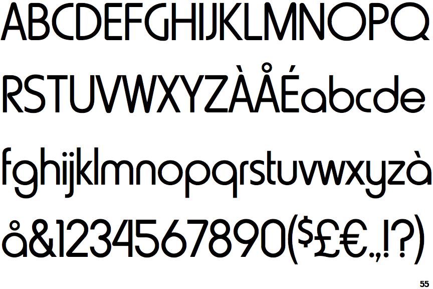
The upper-case 'Q' tail touches the circle.
|
 |
The '&' (ampersand) is traditional style with two enclosed loops.
|
 |
The top storey of the '3' is a smooth curve.
|
 |
The centre bar of the upper-case 'P' meets the vertical.
|
 |
The upper-case 'G' has no bar.
|
 |
The upper-case 'A' has tapered verticals.
|
 |
The right side of the upper-case 'G' has a flat section.
|
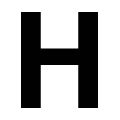 |
The centre bar of the upper-case 'H' meets both verticals.
|
 |
The centre strokes of the upper-case 'W' meet at a vertex.
|
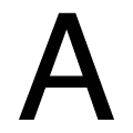 |
The bar of the upper-case 'A' meets both verticals.
|
Note that the fonts in the icons shown above represent general examples, not necessarily the two fonts chosen for comparison.
Show Examples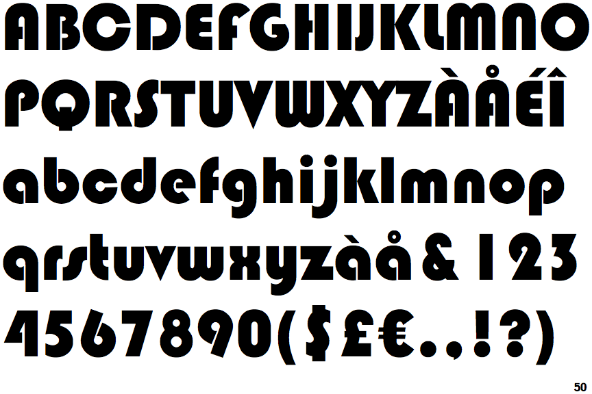
 |
The upper-case 'Q' tail crosses the circle.
|
 |
The '&' (ampersand) is traditional style with a gap at the top.
|
 |
The top storey of the '3' is a sharp angle.
|
 |
The centre bar of the upper-case 'P' leaves a gap with the vertical.
|
 |
The upper-case 'G' has a bar to the left.
|
 |
The upper-case 'A' has parallel verticals.
|
 |
The right side of the upper-case 'G' is curved.
|
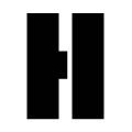 |
The centre bar of the upper-case 'H' leaves a gap with the right vertical.
|
 |
The centre strokes of the upper-case 'W' form one centre stroke.
|
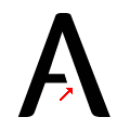 |
The bar of the upper-case 'A' leaves a gap with the right vertical.
|