 |
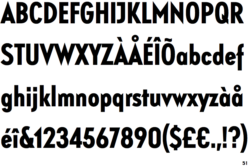
The '$' (dollar) has a single line which does not cross the 'S'.
|
 |
The '&' (ampersand) is traditional style with a gap at the top.
|
 |
The lower-case 'a' stem stops at the top of the bowl (single storey).
|
 |
The upper-case 'J' has a bar to the left.
|
 |
The lower-case 'e' has a straight angled bar.
|
 |
The right side of the upper-case 'G' is curved.
|
 |
The tail of the upper-case 'Q' is straight.
|
 |
The tail of the lower-case 'f' descends below the baseline.
|
 |
The foot of the '£' (pound) has no loop.
|
Note that the fonts in the icons shown above represent general examples, not necessarily the two fonts chosen for comparison.
Show Examples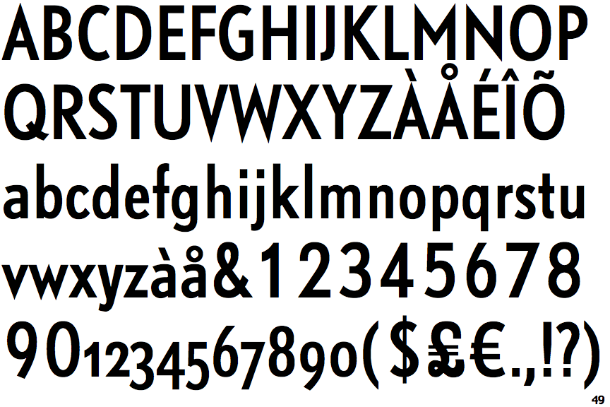
 |
The '$' (dollar) has a single line crossing the 'S'.
|
 |
The '&' (ampersand) is traditional style with two enclosed loops.
|
 |
The lower-case 'a' stem curves over the top of the bowl (double storey).
|
 |
The upper-case 'J' has no bar.
|
 |
The lower-case 'e' has a straight horizontal bar.
|
 |
The right side of the upper-case 'G' has a flat section.
|
 |
The tail of the upper-case 'Q' is curved or S-shaped.
|
 |
The tail of the lower-case 'f' sits on the baseline.
|
 |
The foot of the '£' (pound) has a loop.
|