Identifont

Fonts by Appearance

Fonts by Name

Fonts by Similarity

Fonts by Picture

Fonts by Designer/Publisher

Differences

TweetTweet Differences

Compare: and  

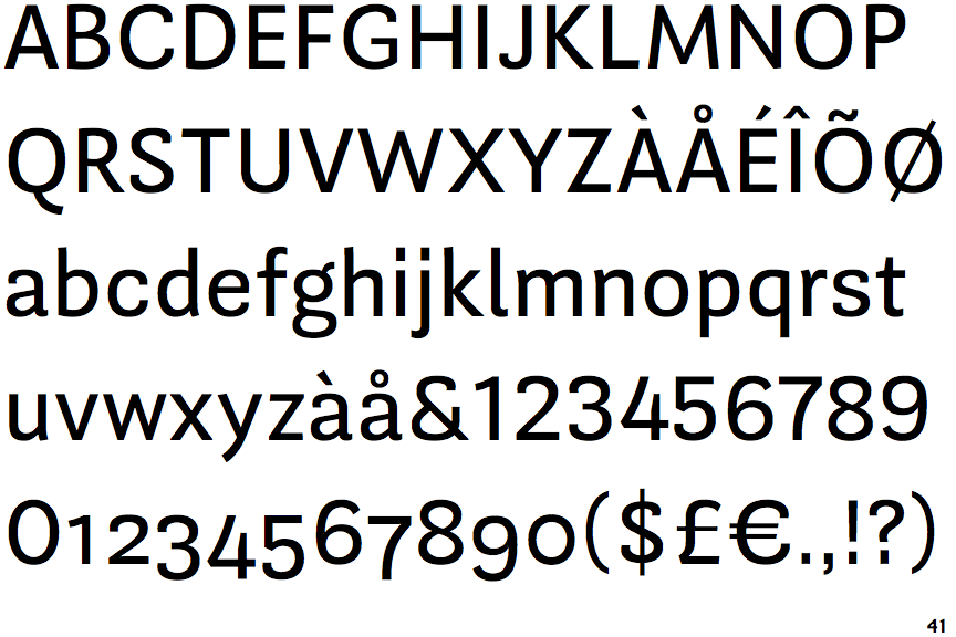
Guanabara Sans

Guanabara Sans

Open
The '&' (ampersand) is traditional style with a gap at the top.
Open
The '4' is open.
Sloping
The verticals of the upper-case 'M' are sloping.
2-Storey
The lower-case 'g' is double-storey (with or without gap).
Right
The 'l' (lower-case 'L') has a right-facing lower serif or tail.

Note that the fonts in the icons shown above represent general examples, not necessarily the two fonts chosen for comparison.

Show Examples
Geneva

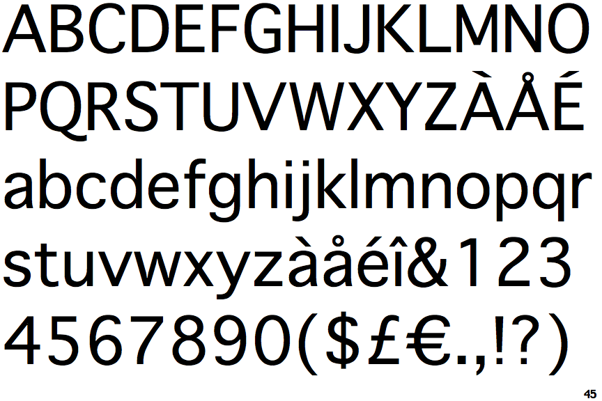
Geneva

Closed
The '&' (ampersand) is traditional style with two enclosed loops.
Closed
The '4' is closed.
Parallel
The verticals of the upper-case 'M' are parallel.
1-Storey
The lower-case 'g' is single-storey (with or without loop).
Plain
The 'l' (lower-case 'L') has no serifs or tail.