 |
The top of the upper-case 'A' has a serif or cusp on the left.
|
 |
The top stroke of the upper-case 'C' has no upward-pointing serif.
|
 |
The upper-case 'G' foot has no spur or serif.
|
 |
The top of the lower-case 'q' has a vertical or slightly angled spur (pointed or flat).
|
 |
The centre vertex of the upper-case 'W' has no serifs.
|
 |
The feet of the lower-case 'h' have two serifs on the left and one on the right.
|
 |
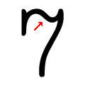
The top of the '7' has a downward-pointing serif or bar.
|
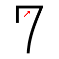 |
The top of the '7' is straight.
|
 |
The upper-case 'C' is symmetrical about a horizontal axis.
|
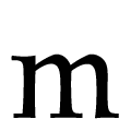 |
The feet of the lower-case 'm' have one serif on the left, two on the centre, and one on the right.
|
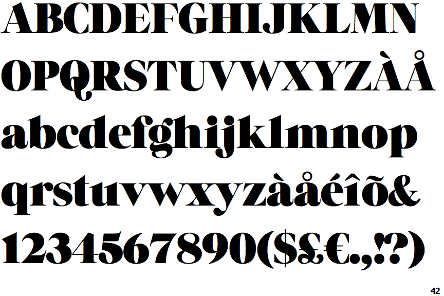
There are more than ten differences; only the first ten are shown.
Note that the fonts in the icons shown above represent general examples, not necessarily the two fonts chosen for comparison.
Show Examples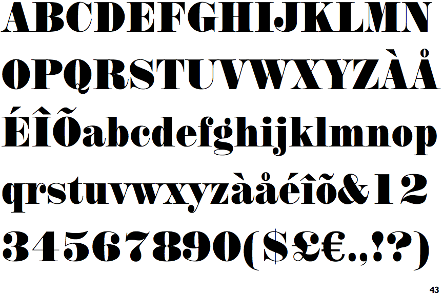
 |
The top of the upper-case 'A' has no serifs or cusps.
|
 |
The top stroke of the upper-case 'C' has a vertical or angled upward-pointing serif.
|
 |
The upper-case 'G' foot has a downward pointing spur.
|
 |
The top of the lower-case 'q' has a right-facing serif.
|
 |
The centre vertex of the upper-case 'W' has two separate serifs.
|
 |
The feet of the lower-case 'h' have two serifs on each foot.
|
 |
The top of the '7' has no serif or bar.
|
 |
The top of the '7' is curved.
|
 |
The upper-case 'C' is asymmetrical about a horizontal axis.
|
 |
The feet of the lower-case 'm' have two serifs on each foot.
|