Identifont

Fonts by Appearance

Fonts by Name

Fonts by Similarity

Fonts by Picture

Fonts by Designer/Publisher

Differences

TweetTweet Differences

Compare: and  

Greyhound

Greyhound

Touches
The upper-case 'Q' tail touches the circle.
Open single
The '$' (dollar) has a single line which does not cross the 'S'.
Open
The '&' (ampersand) is traditional style with a gap at the top.
Below
The upper-case 'J' descends below the baseline.
Open
The '4' is open.
Outwards
The leg of the upper-case 'R' is curved outwards.

Note that the fonts in the icons shown above represent general examples, not necessarily the two fonts chosen for comparison.

Show Examples
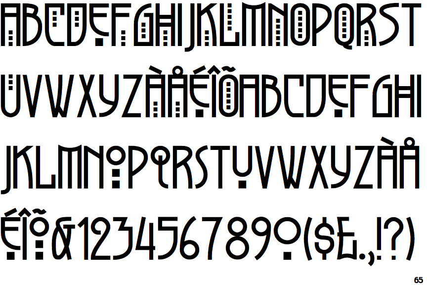
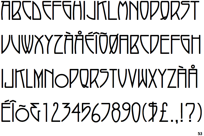
P22 Arts and Crafts Tall

P22 Arts and Crafts Tall

Crosses
The upper-case 'Q' tail crosses the circle.
Single
The '$' (dollar) has a single line crossing the 'S'.
Gap top
The '&' (ampersand) looks like 'Et' with a gap at the top.
On
The upper-case 'J' sits on the baseline.
Closed
The '4' is closed.
Straight
The leg of the upper-case 'R' is straight.